How Skincare Businesses Can Address Concerns to Increase Conversions

If you’re selling creams, soaps, hair or other skin care products online, one of the highest-impact ways you can increase sales and conversion is to address common customer objections.
We’ve advised and worked with numerous skin care companies. Every store has a distinct audience, website, and selection of products. In turn, their customers have diverse wants and needs.
That said, there are shared traits across skin care companies, and it’s worth examining the most meaningful similarities to ask: What are the top objections website visitors have in this particular industry? How should owners of skin care stores structure their product pages? What are the “must haves” a skin care store needs in order to convert visitors into customers?
In this overview, we’ll dive into all that and more. To begin, let’s start with a common sales blocker: customer objections.
Understanding customer objections
A key component of effective marketing is your ability to understand and counter your customers' top objections. Slapping up a product image and a brightly colored “Buy Now” button won’t be enough, especially if you’re selling a luxury skin care product.
Product ingredients
To start, being able to see the full list of product ingredients is increasingly becoming a priority for consumers. Skin care companies need to adapt to this new and growing demand from customers to be transparent about their products.
We often see skin care companies providing a partial list of ingredients, but choosing not to disclose the rest. Curious, we ran a few tests and surveys on product pages for multiple brands. As a result, we unearthed a number of important takeaways.
In every scenario we’ve tested, brands who only displayed the main ingredients, such as seen in the screenshot below, had it backfire on them.

Although buyers wanted to know what the main ingredients were, a large percentage of people surveyed said they felt like the brand was trying to hide something from them. Displaying only the main ingredients felt like a lack of transparency, and as a result respondents became suspicious of potentially harmful ingredients that could be hiding in the products.
The solution to this objection is quite simple, although it can take some time to implement if you have numerous products: display all of the ingredients.
We’ve noticed products that have ingredients that are not 100% natural, like preservatives, are not necessarily selling less than their fully natural alternatives; they simply attract different customer segments. That said, even for products that were not completely natural, the concerns related to the the ingredients were not seen as often if they were displayed.
We were able to safely conclude that displaying ingredients increased customer trust, no matter what the ingredients were.
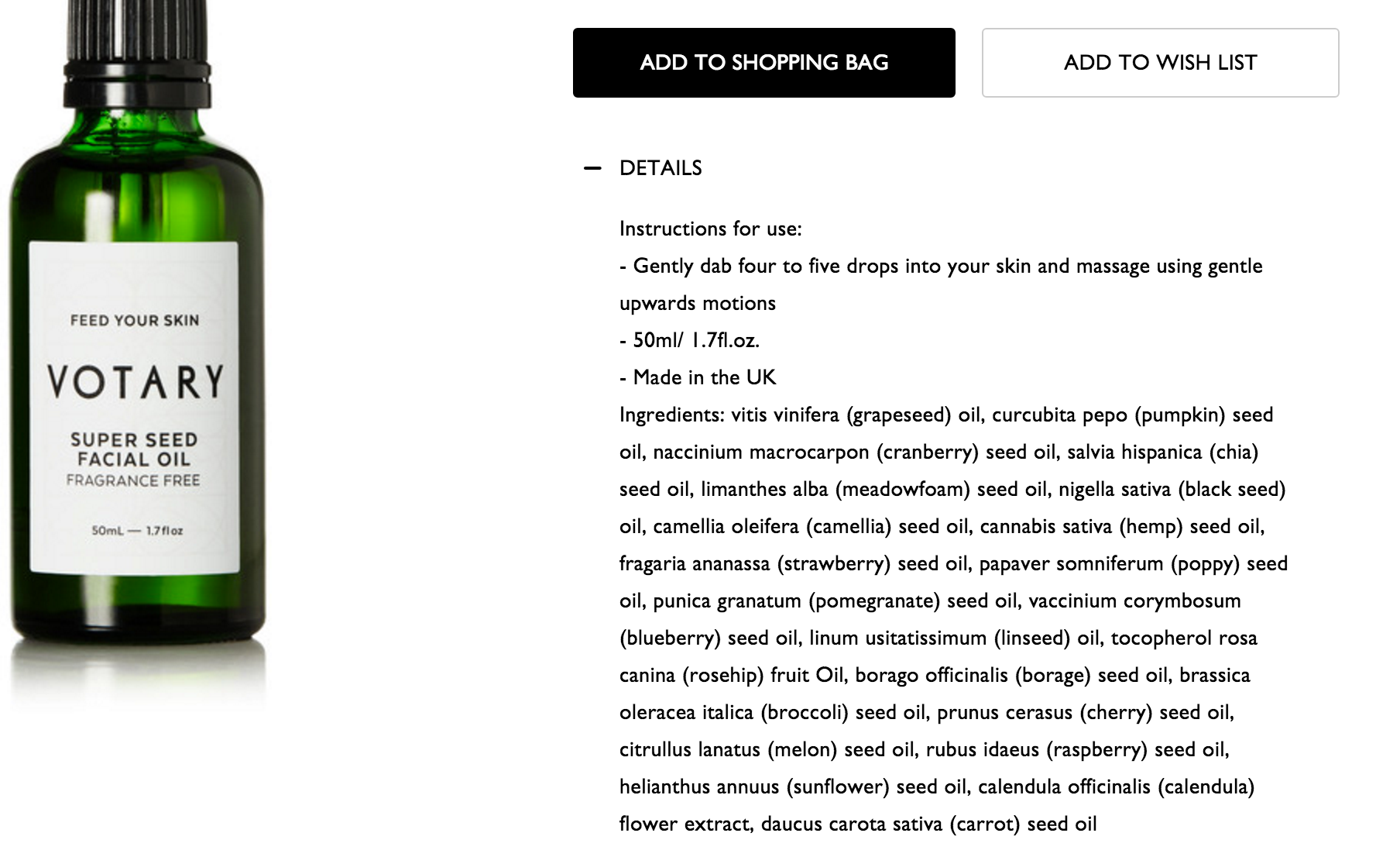
It’s worth noting you don’t need to resort to over-the-top promotion, either. Simply listing ingredients in a separate tab like Net-A-Porter does with their Votary Facial Oil, shown above, is enough to counter this objection in the majority of cases.
Skin reactions
When people are unfamiliar with a product, they step into your store with doubts. When selling high-end products, this truth becomes doubly important: buyers are afraid to spend significant amounts of money on products that could potentially trigger a reaction, which forces them to throw the product (and the hard-earned cash they spent) away.
You have to remember to always empathize with your customers. This is their skin, their lives. People don’t want to buy skin care solutions and get their hopes up just to be forced to discard the product after it doesn’t meet expectations. Someone with acne, for example, doesn’t want to use a product that could potentially throw them back into a cycle of breaking out. The question becomes, how can you facilitate their purchase decision and confidently address their concerns?
Money-back guarantees and customer testimonials are great ways to reassure customers, but specificity is key.
- If a certain product is great for sensitive skin or acne-prone skin, state that directly.
- If you have certain products where people express significant concern about potentially breaking out or getting a rash, but based on your tests and reviews you’ve found these events to be rare among users of the product, address that concern head-on.
You can also incorporate these objections deeper into your product descriptions, so your target audience can relate to and feel like your product is made specifically for them.
What’s the outcome?
People don’t buy products, they buy outcomes. Customers look for solutions that can help them make progress in their lives; your products just happen to be a tool they use to get there.
For example, customers’ interest in anti-aging creams has little to do with being excited about stocking their medicine cabinet with yet another product. They buy these products because they want to soften the aging process so they can look and feel good.
This is an area where a lot of companies fail to speak their customers’ language, and understandably so.
Companies naturally think of their products as a collection of features. Features matter, but to truly succeed skin care sellers need to start thinking about what their customers ultimately want, and what they’re trying to achieve by using their products.
No all-hands meeting or brainstorming session will give you the answers to these questions. You have to do your research and actually hear from your customers.
Take this product description for an “advanced wrinkle relaxer”, otherwise known as an anti-aging cream.
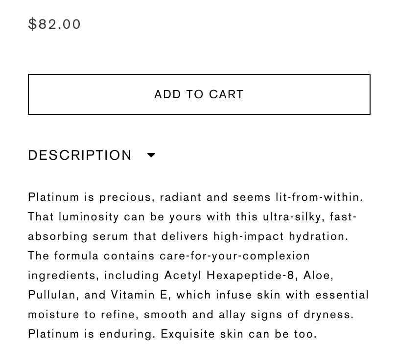
Unfortunately, it’s incredibly hard to discern the benefits of this cream because the description sounds more like marketing gibberish than words intended to educate, inform, and persuade a website visitor into buying. This is what drinking your own Kool-Aid looks like.
Let’s break it down:
- “That luminosity can be yours...” What does this mean for a customer? Are they really looking to be more “luminous”?
- “Contains care-for-your-complexion ingredients…” What does it mean for a customer to take care of their complexion? At the end of the day, what’s the outcome?
- “...to refine, smooth, and allay signs of dryness.” This line is better because it explains that the product helps customers get rid of dryness. That said, it’s phrased in a confusing way that I sincerely doubt is how customers explain it. Do people really say “I want to refine my signs of dryness”, or “I want to allay signs of dryness”? Here is where I’d recommend voice of customer research to determine how their customers talk about their skin, including the exact words they use.
- “Platinum is enduring. Exquisite skin can be too.” This feels like the copywriter is trying too hard to make the product sound high-end. It took me a few reads to understand why there was a reference to platinum, until I realized it’s a part of the product’s name.
The biggest issue with this copy is it means nothing for a customer. It does not inform, nor does it provide details on the benefits of the product or the outcome customers can hope to achieve.
What does it mean for a buyer of this product to have “exquisite skin”? What does an “advanced wrinkle relaxer” help the customer achieve? Is it a skin without wrinkles? Or more youthful, radiant skin? We don’t know, because the product doesn’t tell us. The potential benefits are opaque and confusing.
On the other hand, here’s a product description from Estée Lauder that excels at describing the benefits of the product.
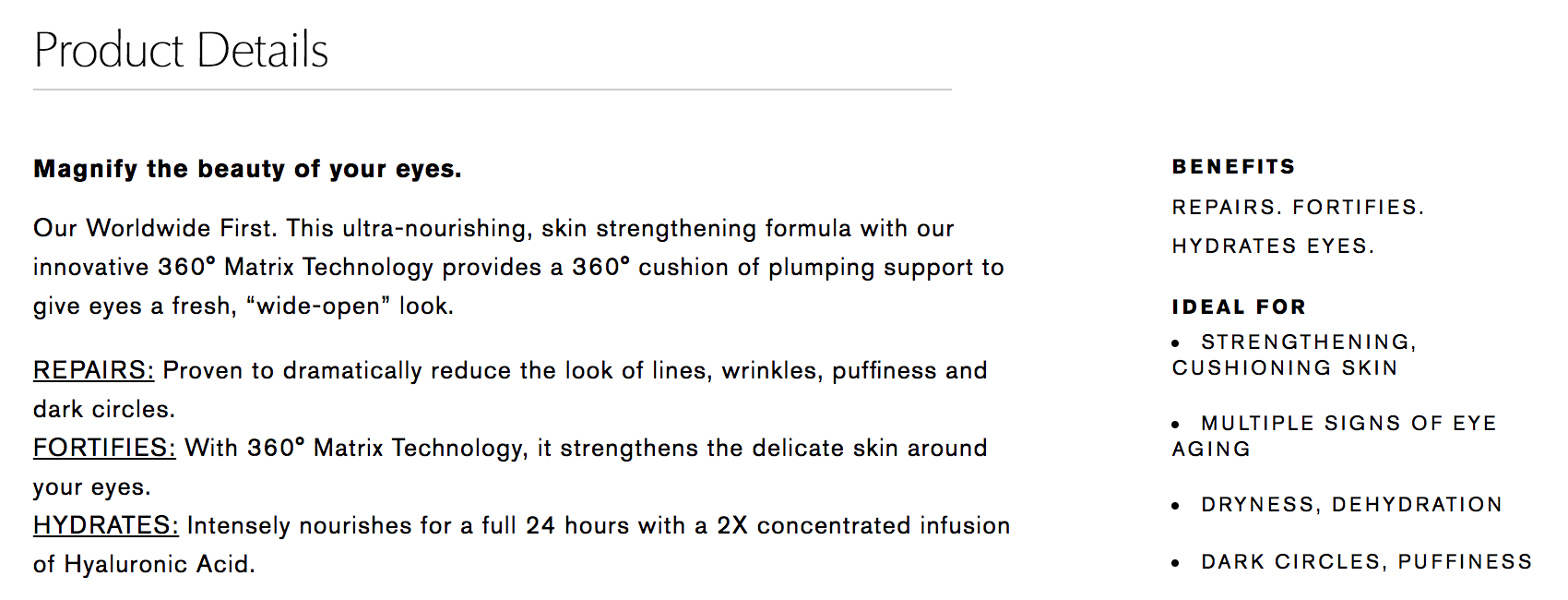
The benefits of this eye cream are clearly articulated and impossible to misunderstand. The initial summary details the features, such as the “360 Matrix Technology”, but what’s great is it’s used to reinforce the benefits: “...to give eyes a fresh, wide-open look”. If you mentioned the “360 Matrix Technology” by itself, without describing the outcome it enables, you’d end up creating more questions than answers.
This copy also digs deep into the distinct benefits the product provides. Below the summary, it underlines that it Repairs, Fortifies, and Hydrates, in addition to providing more detail on these benefits. And if the value still isn’t clear enough, the page has a sidebar that lists who the product is ideal for.
Overall, the page uses words customers are using, makes it clear how the product helps, and clearly describes the benefits. Thumbs up.
A few of Aésop’s product pages are also solid examples of using concise descriptions to pack in a lot of benefits in a comparatively small space, which is great for catching and keeping a buyer’s attention.
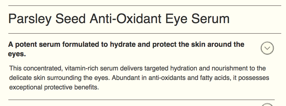
They also have a section on the product page titled “What to Expect”, which is a smart way to get potential buyers to visualize how it would feel to use the product.

At the end of the day, with all the other products out there, if you don’t make full use of your product’s benefits to stand out, you're sure to blend in.
Addressing concerns and uncertainties
Customers’ fears play a decisive role in whether or not they choose to buy. For most types of skin care products, people’s biggest fear is “Will it work?”
This comes as no surprise. Naturally, customers want to see results and will be hesitant to buy if the potential cost in money or outcome (i.e., a bad reaction or skin irritation) outweighs the perceived benefit, whether that’s younger looking skin, getting rid of dryness, or removing dark circles under the eyes.
People want proof, but they’re in their homes, sitting in front of their screen, unable to try the product. How can you allay that fear and provide concrete evidence that they should “Add to Cart”?
Highlight your guarantee
The simplest way to address customer anxiety is to offer a money-back guarantee. Be sure to place it in plain sight: It should be shown site-wide and, most importantly, on the product, cart, and checkout pages.
We helped Kiehl’s develop and test their money-back guarantee, and we made sure it was clear and visible on the product page (among other pages). Here’s a look at the end result.
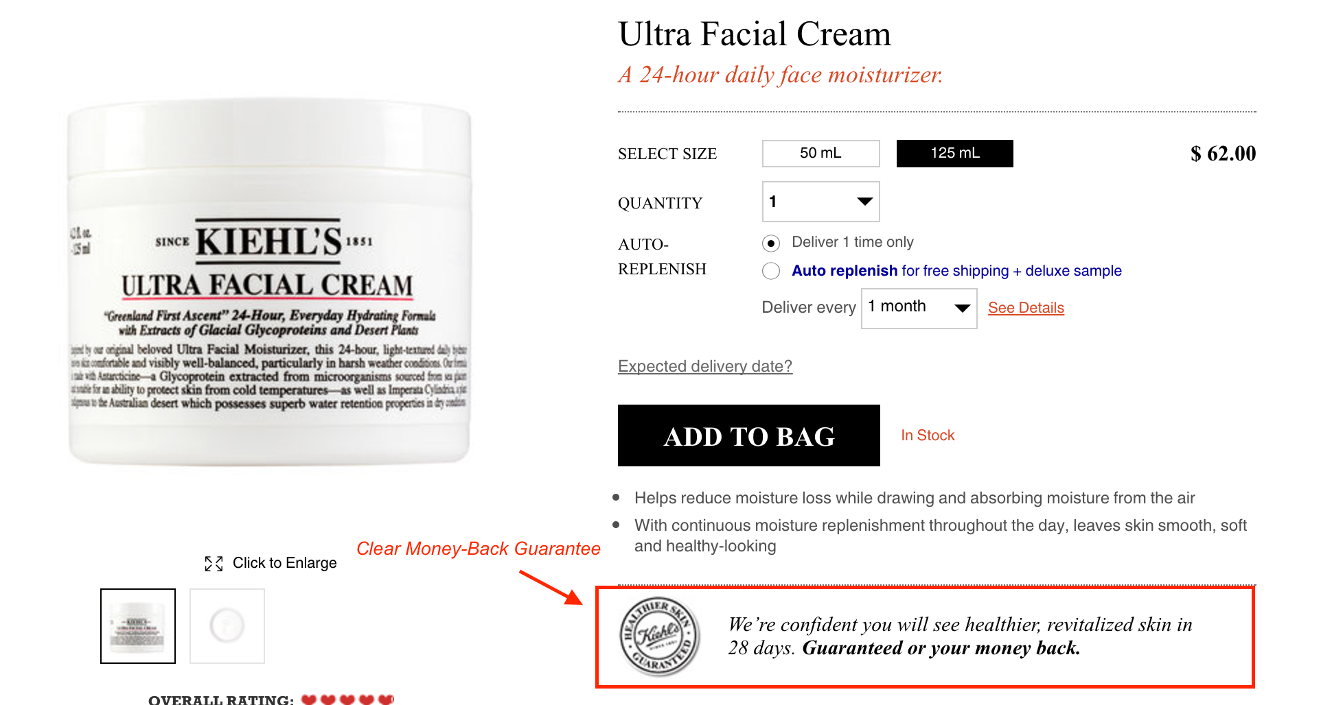
What’s great about Kiehl’s guarantee is it addresses a specific concern. You either see results (healthier, revitalized skin) in 28 days, or you get your money back. This shows the brand has confidence in their products, and that confidence builds trust with the customer.
An alternative I often see is the simple mention of a “Money-Back Guarantee” or “Satisfaction Guaranteed”, which isn't nearly as powerful.
Customers will usually wonder what the terms and conditions are for the guarantee, so not including these specifics creates a problematic situation similar to hiding the product ingredients; even when you’re being truthful, not including important information causes customers to doubt your intentions and integrity.
Offer samples with orders
Another way of building trust with customers is to offer samples with every order. This is a less persuasive element than say, a money back guarantee. However, it helps nudge people who've just bought from you to return to your store to try new products.
Not only will this help you increase the lifetime value of a customer by encouraging them to discover new products, samples in themselves are a nice delighter to add to any purchase.
Though there’s a strong case to be made for product samples, especially for high-end skin care products, whether or not providing free samples will effectively convince people to buy from your store needs to be tested.

Provide proof
There's no better way to show that your products work than by showing actual customer results. If your products have been dermatologist tested, mention this on your product pages, and maybe even add a badge or graphic to show it off even more.
Nudu displays a “Dermatologist Tested” badge next to other icons we refer to as “Objection Badges” on their product pages.

Some companies take this idea even further. We can draw another example from Estée Lauder: they’ve dedicated copy in their product description to highlight the positive benefits seen by women of all ethnicities. I’m not personally familiar with their research results, but I wouldn’t be surprised to find this was a common concern they’ve heard from their customers.
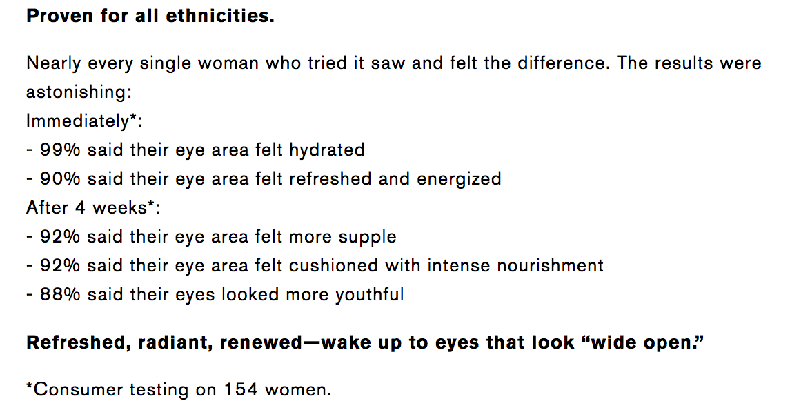
Their sample size is admittedly fairly low, but these statistics are still
valuable for customers to see.
Reviews are key
Finally, when we’ve surveyed hundreds of thousands of people across multiple brands on what nudged them to make a recent purchase, a large number said they decided to buy after reading reviews.
We also ran tests where we made the reviews more prominent and their star ratings more visible. We arrived at a firm conclusion:
Reviews are not “nice to have”, they’re a must-have to get people to convert.
We’ve often heard from customers that even negative reviews have positively influenced their decision to buy. Seeing negative reviews was proof-positive to them that the reviews were not fake, were unedited, and could ultimately be trusted.
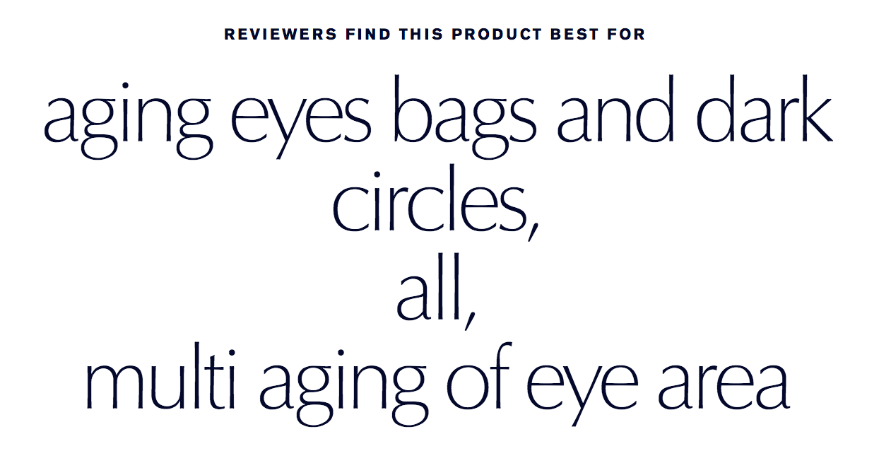
Estée Lauder has a brilliant approach to combining reviews, social proof, and product benefits, shown above.
Right next to customer reviews, they show a crowdsourced list of the benefits most often mentioned by other buyers. It proves to browsers that other people have had results and that yes, the products work.
Can customers see themselves using the product?
We’ve seen in our research that users of skin care products often wonder how the product will fit into their existing routine, and how best to use it.
On top of that, a great way to get people to imagine themselves using your product is to provide them with information to get the most out of said product. This form of education also helps diffuse the doubts or questions they might have that could be preventing them from buying.
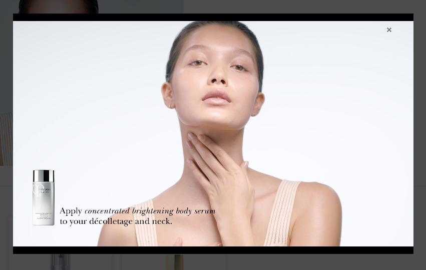
Cle de Peau Beauté, for example, creates videos on how to apply their products on your skin. The videos further reinforce the luxurious experience of using the product, in addition to reducing ambiguity for the customer.
💡 Note: If you want to implement similar videos for some of your brand’s products, I recommend to first test videos on your best selling products, using analytics to track the video plays. This will enable you to analyze and compare which videos are performing best, while giving you the ability to measure the impact of the videos on your conversion rate. Wistia is a great tool for video analytics and sending data to your Google Analytics reports.
See how the behaviors vary between segments, and if the segment with the video had a higher add to cart and purchase completion rates.
The role of illustrations
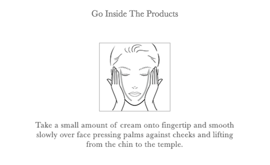
Videos are undeniably a resource-intensive task and take a lot of time and effort to create. Another simpler option for educating customers is to add an illustration and a supplemental description of the steps involved in using the product.
In Cle de Peau’s case, they display the image and instructions below on product pages that don’t have a video.
Adapting for change
Earlier, we talked about the value of transparently listing ingredients. But the truth is the ingredients alone won’t get rid of all the objections a potential buyer might have about what is used to make your products.
Customers also want to be reassured the product they’re buying is safe and free of potentially harsh chemicals. Again, this is especially true if they’re buying luxury products.
We can’t just assume customers will understand the products are safe based on a list of ingredients.
Most customers don’t know the ingredients well enough to differentiate those that are safe from those that are best avoided.
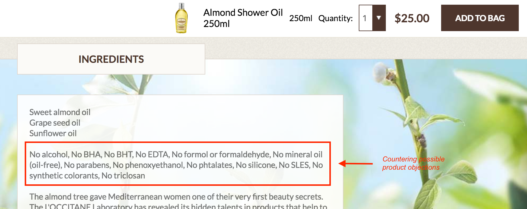
Fortunately, the best solution is quite straightforward: Tell customers your product is safe, and that it’s free of concerning chemicals, and so on. It goes without saying that you should only make this statement if it’s true.
Take L’Occitane en Provence. At the top of their ingredients section, they clearly specify their products are free of multiple things that might trouble their health-conscious customers.
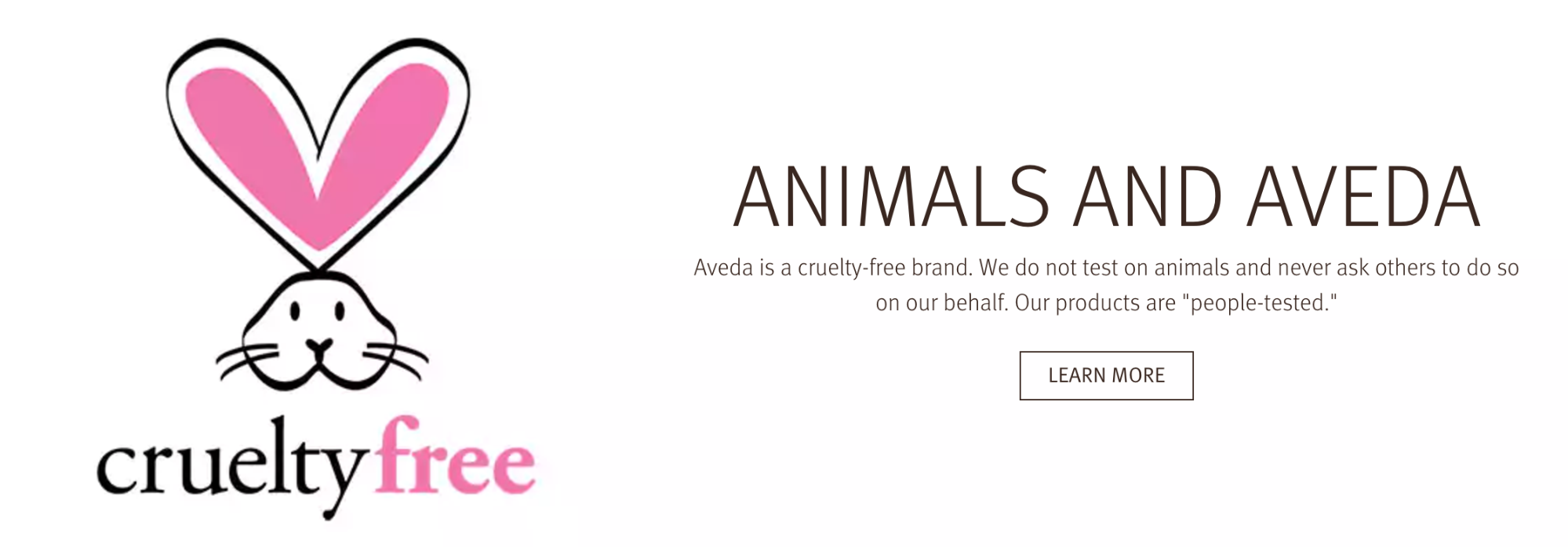
For a number of brands, we’ve noticed customers are very invested in whether or not animal testing was used in developing the products. We even found customers who believed certain brands tested on animals even when that wasn’t the case.
The solution? Make sure it’s clear on your website and product pages that your products are cruelty free and not tested on animals (as always, only if this is true and accurate). Aveda, below, displays this prominently on their homepage.
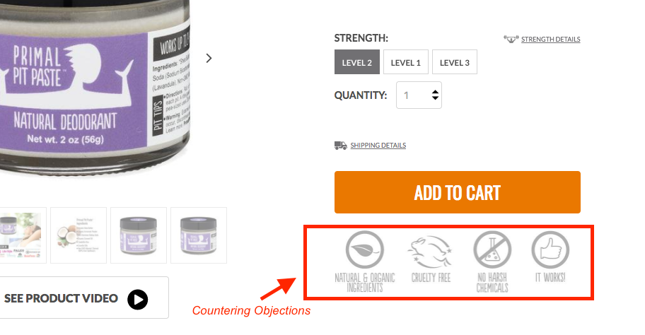
Another broadly useful way to counter simple objections about products is to use “objection badges”. Primal Pit Paste, a company that makes all-natural deodorants, increased their sales by 21% after we helped them redesign their website and product pages.
As part of the redesign process, we tested and implemented the objection badges in order to counter the top reservations we discovered through customer surveys and website polls. If customers were worried about something, we wanted to use these badges to address their worries directly.
Reduce confusion with product suggestions
Customers will invariably try to discover which product is right for them. Brands that have multiple products, and especially those that have multiple similar products (e.g. three types of moisturizers), need to take note.
When customers already have a skin care routine and use various products to achieve the outcome they want, what do you think happens when they start to consider adding one of your products to the mix? Answer: They often get overwhelmed by choice.
What if you have similar products, or varying products in the same category? What if they have specific ailments or are looking to solve a specific concern? They’ll wonder which product line is right for them.
You can’t expect your customer to know everything about your products, or to understand the differences between them.
You have to help surface the right product for each customer. When you’re shopping for skin care in a brick-and-mortar store, you have the option of asking an employee for recommendations. But when people are shopping online, getting such a recommendation isn’t as easy.
To solve this problem, Philosophy implemented a “Skin Care Quiz” that recommends products based on the answers a customer gives to a handful of questions about their skin and what they’re trying to achieve.
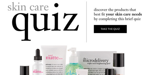
Skin care companies often offer in-store diagnostics of your skin so they can better personalize their recommendations. A skin care quiz does a good job at replicating this for online buyers. For buyers who are still uncertain and have more questions, you can encourage them to connect with your product experts through live chat.
Let customers shop by concern
When analyzing customer support and chat logs of skin care companies, we’ve noticed that one of the biggest questions is, “What’s the best product for [my specific problem]?”.
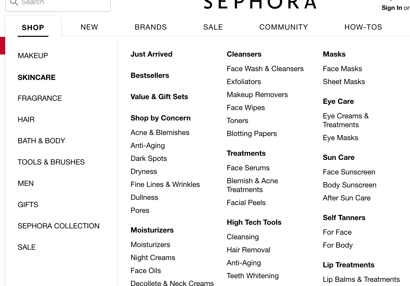
Since people are buying skin care products for results, letting people shop for product by concern can be particularly helpful. For example, you might display the top concerns on your homepage, where customers can click to be taken to a category page listing all products that are recommended for achieving that desired outcome.
You could also let people filter by concern when browsing category pages. Or, you can let people shop by concern directly via the navigation bar, just like Sephora encourages their customers to do.
Finally, if your customers use more than one product as part of their skin care routine, you should expect some to ask about the order in which they should apply each product (e.g., should I apply the toner before the moisturizer? Or after? What about the anti-aging serum? Is it at night only, and if so, is it after the exfoliator?).
Determining the right order in which to use certain skin care products is often a significant source of confusion.
Addressing this concern is key to reducing customers' questions and doubts in order to facilitate their purchase. Take steps to ensure this information is clearly shown on your product pages.
Shiseido has a remarkably clever way to solve this dilemma.
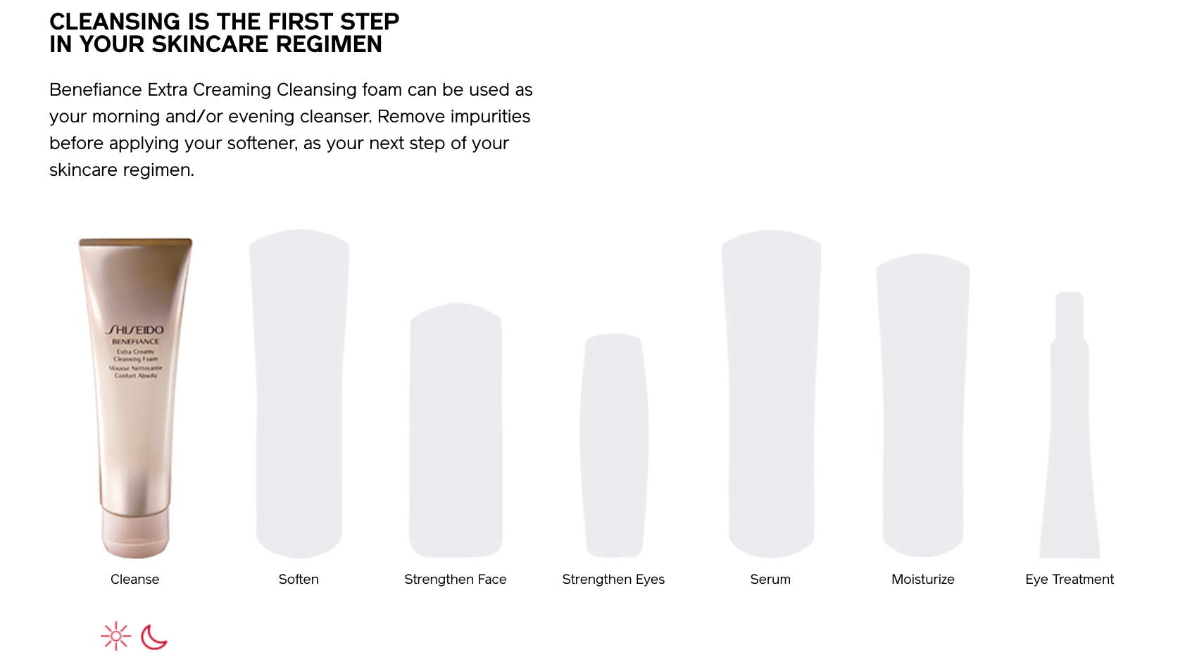
Shiseido displays the order in which products should be applied, and where the product the customer is currently viewing fits in the overall routine. This is a textbook example of effortlessly answering customer questions. It’s simple, visual, and clear.
But don’t blindly copy these ideas
Here’s the kicker: Although these were the most broadly applicable insights we’ve found by consulting with over a dozen skin care companies, that doesn’t mean you should apply everything here to your own store, or that you should wholesale copy any single idea.
Every company is different, every product is different, and every brand (and their ideal audience) is different as well. Trying to apply an off-the-rack solution to your business is sure to result in a poor fit.
Although best practices are often useful starting points, a copy-and-paste implementation, without any testing to speak of, is ill-advised and will almost certainly lead to disappointing results.
Finding exactly what your website needs
There’s only one way to do this: Do your research. For example, before working with any skin care company, we follow a method called the Testing Trifecta.

The Testing Trifecta exists to find exactly what to A/B test and implement on your website by combining quantitative and qualitative research. This is how we found the all the insights mentioned in this post, and how you can find the best approaches for your store. It’s the most important step in taking your conversion optimization efforts to the next level.
From ideas to action
You’ve now learned some of the top insights we’ve discovered to increase website conversions in the skin care industry.
But don’t stop here. Spending your time reading blog posts is a great way to generate ideas, but doing so won’t generate any results. Take the insights from this article and compare them to your own site. Can you identify any low hanging fruit? What can you test today? Now it’s your turn to research, test and learn to skyrocket your ecommerce sales. 🚀