The Science of Decision-Making: How Your Customers Decide What to Buy
 When I was little, my grandma and I would go to the grocery store, browsing up and down every aisle for deals. We’d barely be in the door long enough to plop all of our bags down on the counter before my grandpa would say, “Helen, what is all this?!”
My grandma loves to buy things on sale. If she were a cartoon character, her catchphrase would be, “Oh, Larry, one of the girls will need it.” My mom and aunts couldn’t leave my grandparents’ house without a trunk full of household supplies.
How could two people approach purchase decisions in such drastically different ways? To my grandpa, the purchases were completely illogical. (Who could possibly use that much ketchup?) To my grandma, the purchases were completely rational.
What gives? It turns out dual process theory was hard at work.
What is dual process theory?
Dual process theory is the idea that there are two different systems at work during the decision-making process: system one and system two. One process is automatic and unconscious while the other is controlled and conscious.
The theory dates all the way back to the 1800s and William James, an American philosopher and psychologist who paved the way for more modern interpretations. If dual process theory sounds familiar, you may have read Thinking, Fast and Slow by Daniel Kahneman, who popularized the theory in 2003.
What is system one?
System one is that automatic and unconscious mind. It:
- Requires very little, if any, effort.
- Is fast.
- Is primal, old in terms of evolution. (In fact, it’s often referred to as the “reptilian brain”.)
- Has a large capacity.
- Isn’t logical.
System one is always at work; it’s always on.
What is system two?
System two is the controlled and conscious mind. It:
- Requires a lot of effort.
- Is slow.
- Is modern, new in terms of evolution.
- Has a small capacity.
- Is logical.
System two requires your full focus and is quickly depleted.
Why we’re not as rational as we think we are
As humans, we like to believe we’re rational people making rational decisions. The truth is it’s very rare for humans to make a genuinely logical, rational decision.
System two is absent more often than not. That means for most of the day, you’re using system one to make instinctual and emotional decisions.
So, why do we believe we’re more rational than we really are?
System two is often responsible for rationalizing the decisions of system one. For example, let’s say you purchase a new t-shirt after seeing a funny Facebook ad. You didn’t make the decision using sound logic and reasoning, but system two will “wake up” and rationalize the otherwise irrational decision for you.
“It was on sale”, “I needed a new gym shirt”, “The t-shirt quality is great”. As soon as that purchase is made, system two is hard at work rationalizing system one’s decision—the decision you made on instinct alone.
In the end, you think you’ve made a logical decision and remain blissfully unaware of how influential system one really is.
When to appeal to system one and system two
System one and system two work together, as demonstrated above. It’s impossible to completely isolate one and appeal directly to the other.
So, how can you use dual process theory to your advantage in marketing?
First, ask yourself: Are my products truly the most rational purchase decisions available? We don’t like to admit it, but more often than not, the answer is no. There can only be one “most logical” purchase decision, after all. In ecommerce, it becomes especially difficult because the odds of every single one of your products being the best of the best drops to near-zero.
Even if you are one of the few exceptions and all your products are truly the most rational purchase decisions available, you have to remember that system two is easily depleted. Your visitors can quite literally run out of capacity for logical decision-making daily.
If you’ve only focused on logic and system two, you’re out of luck and out of a sale. The best approach, then, is to start by covering your bases with system one. Make sure your site appeals to that automatic, unconscious mind first and foremost.
If one of your products truly is the most rational purchase decision, add appropriate triggers to your product page that will “wake up” system two. That is, if it hasn’t already been depleted for the day.
How to appeal to system one
If you want to appeal to system one, the unconscious mind, you’ll want to either deplete system two or avoid “waking” it up. Of course, there are many more ways to do that than I can list in this article, but I’ll cover a few examples.
1. Use up system two’s capacity
System two gets depleted the more it’s used and we already know it has a small capacity. So, if you want to force a system one decision, the best way to do that is to present simple choices during the checkout process. Every decision system two makes depletes it just a little bit more.
For example, Death Wish Coffee presents buyers with a few different choices:
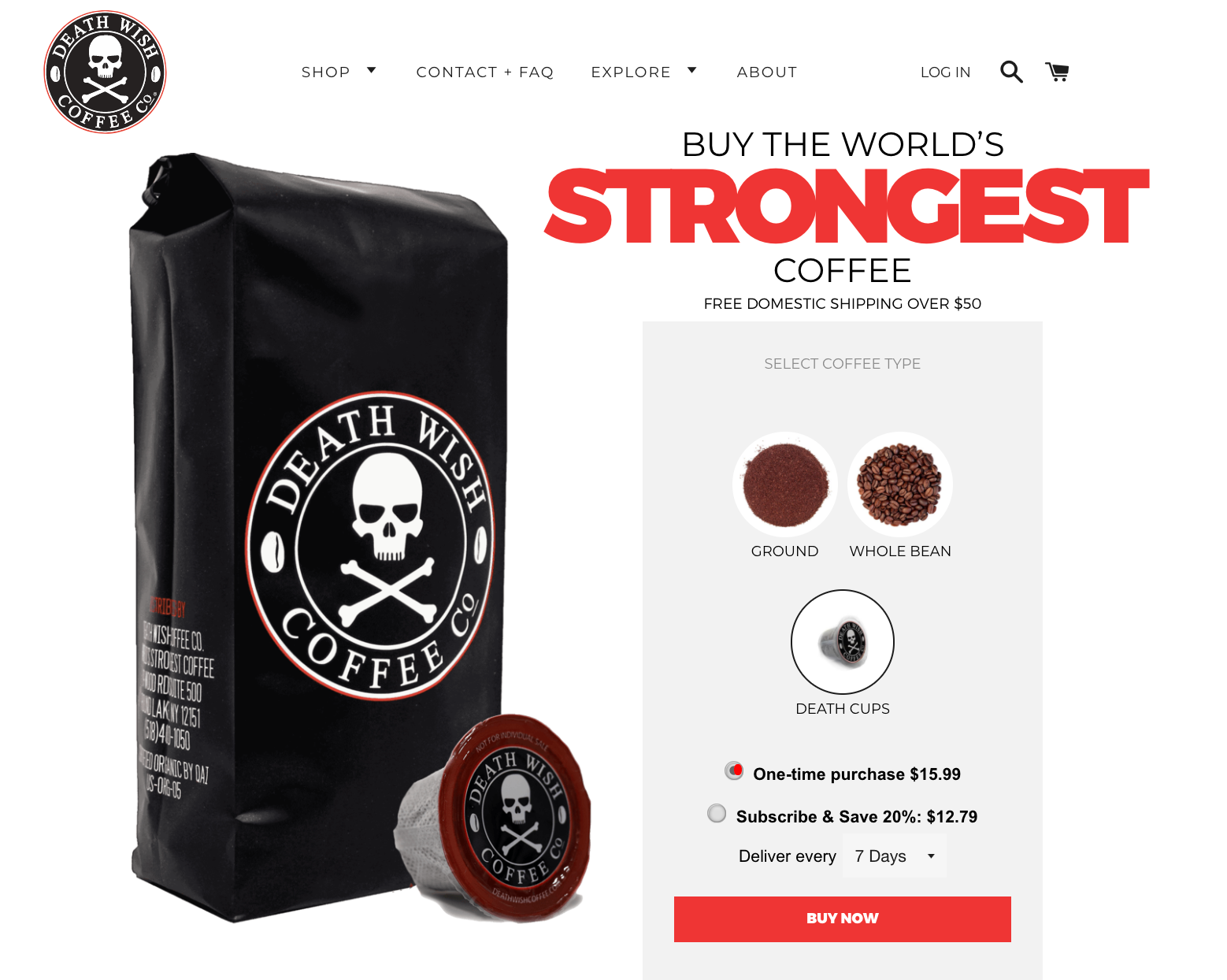
Do you want ground coffee, whole bean coffee or death cups? Do you want a one-time purchase of $15.99 or do you want to subscribe and save 20%? If you do want to subscribe, do you want the coffee delivered every 7 days, 14 days, 30 days or 60 days?
There is a degree of customization here, which means choices. Those choices tire system two out, helping to deplete its small capacity.
Now, notice that while there are choices present in the example above, there is nothing difficult or confusing about the checkout process. Yes, adding choices is effectively adding a small amount of friction. Sometimes friction can be a good thing, though, like increasing the number of fields on a lead gen form to increase the quality of leads.
Just be careful you don’t go overboard. Making the checkout process difficult or confusing will deplete system two, but it will also throw off system one, which craves simplicity. It’s a delicate balancing act.
2. Use visuals liberally
You might be familiar with stats like “visuals are processed 60,000 times faster than text” and “65% of people are visual learners”.
Cue the rise of infographics and videos, am I right?
System one is more visually oriented than system two, perhaps because it is evolutionarily older. For survival purposes, it’s always been important that our brains process visuals quickly.
To appeal to system one, ensure your visuals meet the following criteria:
- They are simple and clear. Remember, system one is automatic and unconscious. If the visuals are not clear, relevant and straightforward, the meaning (and impact) will be lost.
- They articulate the benefit. You’re familiar with the idea that you should sell benefits, not features, right? Use images to articulate the benefit of your products. How will buyers feel after the purchase? How can you visualize that feeling?
For example, Harris Farm Markets uses nature visuals to reinforce the fact that they are all about encouraging people to “reconnect with the natural joy of food”:

Nature is at the center of the Harris Farm Markets brand and company. Prices, produce and specials are driven by nature. The bee and blueberry visuals get that point across immediately, much faster than reading the text.
Note that you want to visually appeal to system one at important points during the checkout process. Before the add to cart step, for example. Think carefully about how to do that because you want to visually persuade without visually distracting, which can be a difficult balance to strike.
3. Keep it as simple as humanly possible
Kayak is arguably one of the most complicated sites I’ve ever had to use:
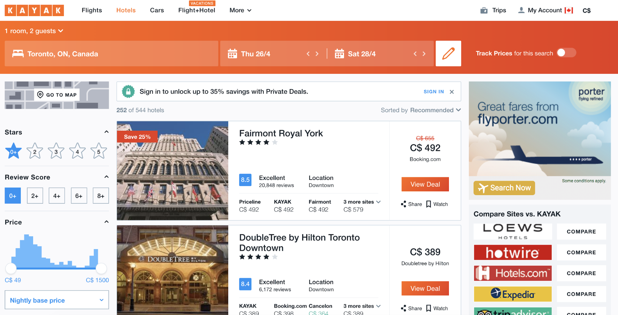
Above, I’m simply looking for a hotel room in Toronto, Canada from April 26th to April 28th. Immediately after entering that required information, I was taken to the page above.
Ads, filters, price comparisons, star ratings, number ratings, share, watch, “Save 25%” banners, comparison calls to action, sorting options. Where on earth am I supposed to look? If I’m just here to find a cheap hotel in Toronto, boy am I getting more than I bargained for (read: asked for).
Kayak is the proverbial alarm blaring, begging system two to wake up.
Nothing about the above page says “automatic” or “unconscious”. It requires genuine thought to navigate in a meaningful way. Now, perhaps that’s Kayak’s plan, perhaps they want system two bright-eyed and bushy-tailed, but if you don’t, keep it simple.
4. Play on familiarity
Simplicity is key for system one, this we know. An underappreciated way to create simplicity and a truly intuitive visitor experience is familiarity. Why? Because of what’s called the mere-exposure effect, a cognitive bias that quite literally means that merely being exposed to something can create a certain type of fondness for it.
For example, you’re more likely to develop a friendship with someone you see every day. If you were to stop seeing them so frequently, you might find yourself slowly losing touch. Why? All because your preference for one another (i.e. friendship) was likely fueled by mere exposure.
This isn’t just applicable to relationships and friendships, of course. It’s applicable online as well. As users of the Internet, we develop preferences for certain designs and prototypes simply because we see them all the time. For example, I’m willing to bet many people find the hamburger menus on mobile more appealing now than they did a couple years ago.
In ecommerce, visitors are used to seeing the cart in the top right corner, for example. On product pages, they’re used to seeing the product image on the left and the product details on the right. They’re used to seeing the price clearly marked. They’re used to seeing a big, obvious “Buy” or “Add to Cart” button.
Look how well Studio Neat sticks to simple, familiar ecommerce design:
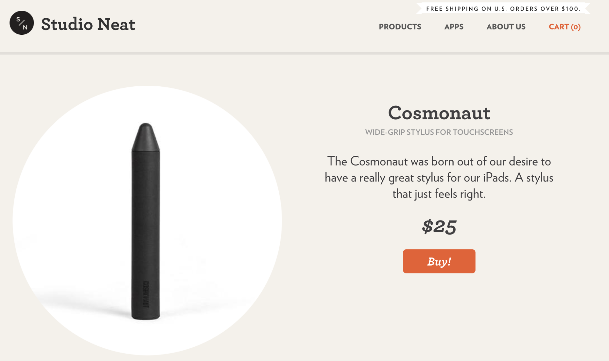
It’s familiar, it’s predictable, it’s intuitive. This level of simplicity allows system one to get in and out without waking system two.
How to appeal to system two
If you want to appeal to system two, the conscious mind, you’ll want to wake it up, avoid depleting it and keep it focused. Of course, there are many more ways to do that than I can list in this article, but I’ll cover a few examples.
1. All rise for the surprise
Anything unexpected will throw system one for a loop, which means system two will be called upon. For example, here’s an exit intent popup you receive when visiting Poo-Pourri for the first time:

Yes, even something as simple as a newsletter subscription popup can leave system one gently shaking system two awake. It’s unexpected and it requires a decision: do I sign up or do I leave?
Think of surprise as the opposite of familiarity. Anything unexpected (e.g. a popup, an on-site survey, a snippet of clever copy, an eye-catching image) will slow system one’s mechanical routine and wake system two.
On that note, ensure whatever you’re using to surprise system one isn’t too taxing for system two. Remember, system two is likely already running low on capacity and you want to use some of that capacity later on. With great power comes great responsibility, folks.
2. Just the facts, ma’am
System two is the logical mind, so it makes sense to stick to the facts. After all, there’s no point waking system two if you can’t prove your product is truly the most rational purchase decision.
If you’ve ever purchased a laptop or smartphone online, you’re probably very familiar with the “just the facts, ma’am” approach to persuasion.
Here’s how Tortuga, a travel backpack company, does it:

Straightforward, side-by-side comparison of three core backpack products. Everything system two needs to make the right decision.
Remember, though, system two will want to heavily vet the options, which will include your competitors. The easier and faster you make it to compare your products to one another and to competitive products, the better.
Experiment to find a balance between providing the compelling facts and not overwhelming system two’s limited capacity. This is not a free pass to list every product spec you can think of or go overboard with competitive price comparison, which can ultimately leave customers overwhelmed with choices.
Every purchase decision is unique
My grandma’s system one was making purchase decisions that my grandpa’s system two simply couldn’t comprehend or rationalize.
Still, every once in a while he’d come puttering home in a beat up old car that he insisted he had to buy. “I’ll have ‘er up and running in no time, Helen.”
No one is a logical, conscious buyer all of the time. No one makes all of their purchase decisions with one system exclusively. The two systems work together depending on the context and number of previous decisions made that day.
Learning about dual process theory and how it really works is the first step toward using it to your advantage. If you want to influence decisions, start with understanding how your visitors decide.