How to Optimize Your Product Pages For More Sales: 11 Expert-Recommended Tips

You open up your store to check on your sales funnel, and you can see you have some work to do.
You’re doing a great job of getting people to your store, but the numbers are crystal-clear. You’re not getting enough of those visitors to add things to their carts.
You know your product pages should be convincing more people to add your (awesome) products to their carts, but they don't seem to be—and you're not sure why not, or how to fix it.
Don’t worry. There are experts for that, and thanks to Shopify’s Partner Program, we have them on speed-dial.
We know that a high-converting product page is worth it’s weight in gold (and a little bit more, since web pages are notoriously light) so we asked our squad of experts how you can level up your product pages.
They delivered, with great advice and even better examples. Here’s what you can learn from heavy-hitting product pages, designed and crafted by the pros.
The basics: what makes a great product page?
In theory, product pages are simple. You want to give your ideal customer the right amount of information to help them buy the product they want, and convince them that buying this product is going to work out for them.
As Rosara Joseph, Content Strategist at VentureWeb puts it,
“The paramount goal for your product pages should be to build user confidence by providing all the information necessary for a purchasing decision and making the process as intuitive and straightforward as possible.”
But if you’re thinking that’s easier said than done, same. So how are you supposed to start?
There are four things that come together to create a truly great product page:
- Your product
- Your brand
- Your copywriting
- Your page’s design and user experience
Your product is obviously center stage, since this is its chance to shine, but what exactly you’re selling might inform how it’s presented—and what questions your customers have before they can commit to buying.
Your brand is important everywhere, from social media images to your post-sale emails, but it’s especially important on your product pages. With the way products are discovered these days, someone might never see your homepage before buying from you, so branding on your pages matters.
Your copywriting is important, because it’s how you combine the written information your customers need with your brand’s unique voice and tone.
Your page design, and your user experience, is going to be informed by all of these things, but there are nuances involved, especially from the user’s perspective. How things are arranged on the page, and what’s included, can have a big impact on your conversions.
With all that in mind, here are 11 specific things our team of Shopify Partner experts recommended you keep in mind when you’re working on levelling up your product-page game.
1. Do you have a clear call-to-action (CTA)?
You’ve got one goal on a product page: get your customer to hit “Buy” (or “Add to Cart,” or whatever you label your main call-to-action button). That’s why Maria Bonello, Director of Strategy at SMAKK Studios recommends that you start there if you’re troubleshooting your product page, or building one from scratch.
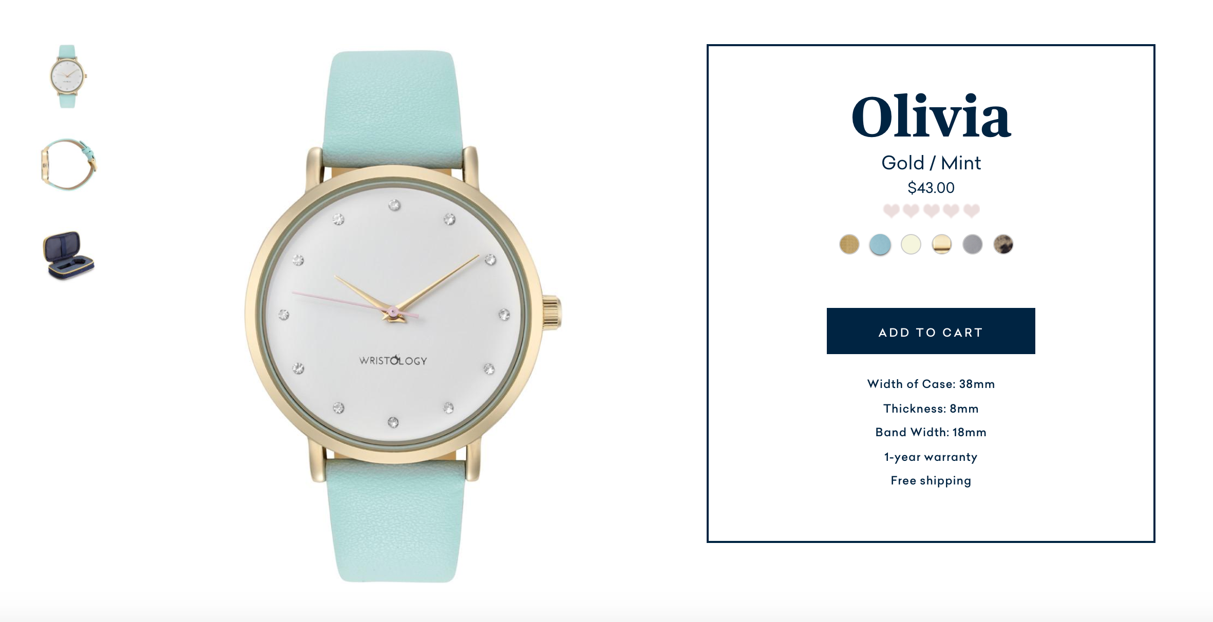
Wondering what that looks like IRL? Here’s an example that SMAKK Studios designed for Wristology.

You can see that the CTA button takes a beautiful center stage position, sits above the fold, and there’s nothing in this section of the page that’s drawing your attention away from the reason you’re there. (Which is buying.)
To add to the clarity angle, Courtney Hartmann Tisa from Internet Marketing Inc. has a bit of extra advice on the copywriting side.
"Don't try to be clever with CTAs. Direct 'Add to Cart' or 'Submit Order' will do."
“Don’t try to be clever with CTAs. Direct “Add to Cart” or “Submit Order” will do.” There’s a time and place for clever branding and copywriting (which we’ll get to in a second) but you want to make sure you’re not confusing someone who just wants to buy your stuff.
2. Do you have great product photography?
There are so many perks to ecommerce.
You can sell to the world! You don’t have the high overhead of a retail space! But you also have some challenges, and one of the biggies is that your customers can’t usually see, touch, taste, or try your products IRL before they buy.
That’s why product photography plays such a major role on your product pages, and why almost every expert we spoke to brought it up as a key factor in building a great page.
And the impact of great product photos goes far beyond just your product pages, in case you’re still on the fence about investing in your photos.
Just think about all the holiday gift guides happening right now. If you don’t have great, versatile photos, how likely are you to get chosen for them? Exactly.
3. Do you have the right product photography?
There are a lot of ways you can create great product photos, and some clear guidelines that apply to everyone.
That said, your products are unique, which means your product photos need to be, too. Maria Bonello of SMAKK Studios shared a bit of the thought process behind how they make sure to highlight the important parts of a product with photography—specifically, with Chinese herbs.

She goes on to talk a bit about how you can do this for your own brand.
4. Do you link your images to your variants?
Naming your product variants (colors, scents, etc.) can be a great way to add some personality to your products, but if you take it too far, your potential customers might not know what “Frosted Dreamscape” actually looks like on a t-shirt. Is it pink? White? Multicolor? Transparent?
That’s why linking your images to your product variants is so important, and can help increase your conversions on your product pages, says Alan Schaffer, Director at Bismuth Studios.
“Not linking images to your variants is one of the most common mistakes I see people making. Often people name their colors with funky names, making it hard for customers to be sure they are picking the right color.”
Personality is great, just as long as it comes with an equal dose of clarity.
5. Do you have the right amount of detail for your price?
If you’re selling at a low price point, you might not need the same amount of detail as a luxury item. But if you are on the higher end of the luxury (and price) scale, you’ll need to take that into account when you’re writing your product page, advises Alan.
“If you have a simple product with a rather high price point you need to make sure that your copy will help you backup that price. Make sure you describe properly the materials, the origins and the passion behind this product.”
"Often merchants think their customers know and understand the products as much as they do, but that couldn’t be further from the truth."
Even if you’re not a premium brand, and you never want to be, it’s worth evaluating if you have enough information on your product pages to answer your customers’ questions. It just becomes critical when you’re aiming for a premium price.
6. Do you have the right amount of detail for your customers?
Your product and its price are two things that can guide the amount of content you have on your product page, but the most important factor is always your customers.
You need to provide enough content for every customer, whether they’re already an expert in what you sell, or if they’re just starting to learn about your products, says Rosara Joseph from VentureWeb.
“Your product pages must contain information that caters to your current and prospective customers. Some of your users will be experts in the type of products you sell, others will be coming with less background knowledge. Make sure that the information you share is useful and understandable for as many as possible, without patronizing or talking down to your users.
For example, we work with adventure and outdoor brands. One challenge we’ve had is ensuring that our clients’ product pages strike the right balance between tech geek content (the numbers and stats about measurements, weight, materials used, etc) and content which translates to a less tech-focused person. Always be mindful of communicating the consumer benefit for your product’s features. For example, a mountain bike with bigger suspension offers more control and stability on fast, gnarly terrain, but is unnecessary if most of your riding will be on gravel paths."
"Always be mindful of communicating the consumer benefit for your product’s features."
And if you’re wondering how this might apply outside of the adventure world, don’t worry—Rosara gave us some specific tips to help strike this balance on your product page.
- Well executed product videos can condense lots of complex details and storytelling into a short clip.
- Use UX features such as drop down tabs, overlay or pop-over boxes, and content that reveals when you hover over. That will ensure that users who want to read more details can easily find that information, without overwhelming or crowding the page.
- Use a clear structure and hierarchy in your copywriting. Careful use of headings and subheadings will make it much easier for users to scan through your content and find what they’re looking for more easily.
- Anticipate the questions your target users will have, and create useful product guides which directly answer those questions.
7. Do you have a well-branded product page?
Your brand isn’t just your social media graphics and your logo. It’s everything you stand for, who you serve, and why you do what you do (although yes, the graphics matter too!) And your brand can be a make-or-break part of your product pages, says Mark Perini, Founder of ICEE Social.
So how can you do that? Well, Perini recommends a simple thought exercise to get you going.

8. Do you have aspirational content?
Most customers (other than your mom) aren’t buying your products because they love you. They want your products to do something for them—solve a problem, make them better, help them do something. Your product pages should make it easy for them to see how your products can do that.
“Make your content provide an answer to an aspiration,” advises Rosara Joseph from VentureWeb. “Think about how your product can help make your users’ lives more fun, enjoyable, or efficient. How does this bike make you a better, faster rider? How will these skis make you ski like a rock star in the deep powder?”
"Think about how your product can help make your users’ lives more fun, enjoyable, or efficient."
This was echoed by several of our experts—aspirations matter to your customers, and your product page. As Maria from SMAKK Studios elaborates:
9. Do you have content that sounds human?
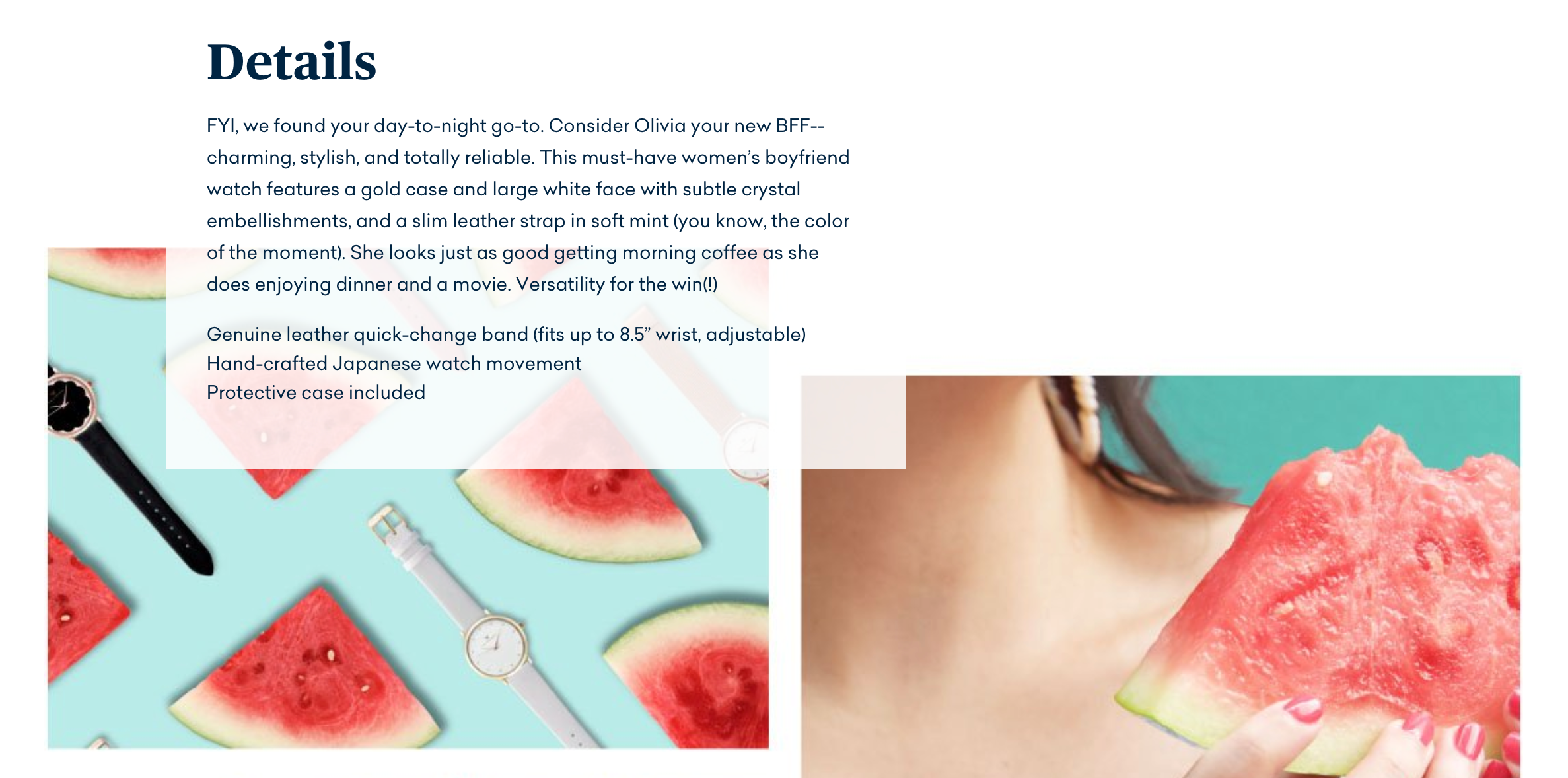
When you’re trying to get all your features onto the page, it can be easy to slip into boring bullets and uninspired paragraphs. That’s fine for a first draft, but before you publish your page, make sure to go back and build in a bit of your brand voice.
“Descriptions don’t have to be bland - invest the time and energy to speak to your users,” advises Maria.
“Think about who you’re writing to and how you can make your brand come to life. Would it be on brand to say y’all? Great, go for it! But if something doesn’t feel on brand then don’t try to make it work, it won’t be authentic to who you are and it likely won’t resonate with your audience, either. It’s equally as important to remember that most of your users won’t read so don’t write too much copy. You have about .02 seconds to make an impression on so make it a lasting one by owning your voice!”
If you want to see this in action, Maria has a great example cued up: Wristology.

10. Do you have social proof?
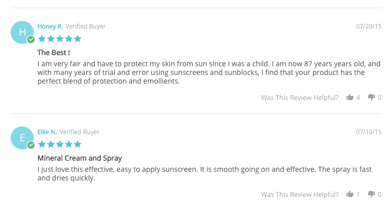
At the end of the day, a product page is a landing page, so you can steal some of the best practices from more “traditional” landing page advice. It wouldn’t be a landing page without some social proof, and the same goes for your product pages.

"This is an example from MD Solar Sciences. They get consistently stellar reviews, so we made them a focal point to increase consumer confidence in their sun care line.”
11. Do you have a good understanding of your customer?
To make any of these decisions well, from how much detail to include, to which product attributes to highlight in your photography, you need to really understand who your customer is and what they want from you.
Maria shares an example of how they were able to use a customer profile to really dig into what would make a great product page: Phoebe James. SMAKK Studios worked with the brand to define an ideal customer, and adapt the store (and the product pages) to suit her.

So what makes a great product page?
It’s not as simple as choosing one of these pieces of advice and calling it a day. Your product page is always going to be a balance between all of these factors, and it’s going to evolve as you go.