Emotional Persuasion 101: What It Is, Why It Matters and How to Use It
 Understanding psychology is the key to understanding decision-making processes. Often, what you think you know about how decisions are made and why conversions happen isn’t so black and white.
Many people think a logical argument with facts, figures and product specs is the best (and only) route. The truth is that the brain is quite emotional.
A better understanding of how the brain makes decisions and how emotional persuasion works will help you improve conversions (and your bottom line).
First, why does emotional persuasion matter?
You’re not as in control of your decisions as you think you are. The good news? Neither are your customers, and you can use that to your advantage.
We like to think we’re logical people making logical decisions, especially when it comes to how we spend our hard-earned money.
Enter dual process theory, which states that there are two different systems within your brain: system one and system two. System one is your emotional processor. It’s automatic and unconscious. System two is your logical processor. It’s controlled and conscious, but much slower.
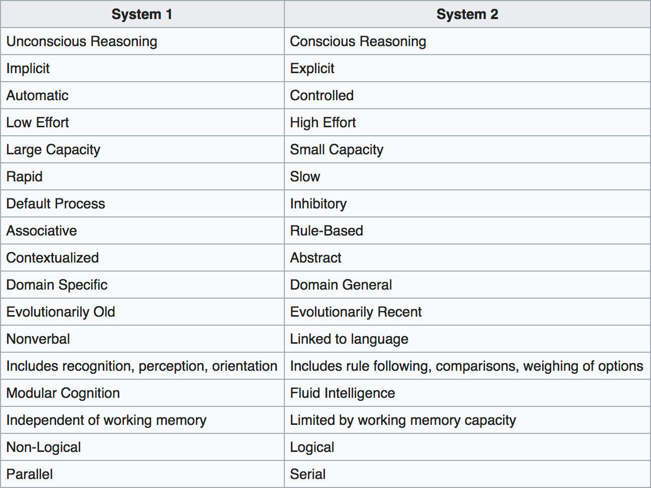
System two is easily depleted because it’s slow and requires your full focus. The more time you spend thinking critically throughout the day, the less and less you’ll see system two pop up when it’s time to make a decision.
System one, on the other hand, is always around, which is why you might initially make an emotional decision and rationalize it later. You see, system two doesn’t like to think a decision was made purely upon emotion, so it rationalizes the emotional decision after the fact.
For example, let’s say you bought an expensive clothing item online late at night after a long, hard day at work. By the next morning, system two will likely have assured you that the free shipping and an upcoming event make the pricy purchase totally logical.
So, system one is a huge factor in decision making, right? Yet marketers continue to appeal to system two, the logical processor, almost exclusively. Even if your product happens to be the most logical option in your entire industry, there’s a solid chance your customer’s system two will be depleted at the time, causing her to default to system one.
To be clear, system one and system two work as a decision-making team. Ideally, your store will persuade both systems, but if you have to choose between the two, choose system one because it doesn’t get depleted.
TL;DR? We’re emotional people making mostly emotional decisions. It’s time to start optimizing accordingly and stop writing emotional persuasion off as wishy-washy voodoo.
Introducing Valence and Arousal
Emotional reactions are driven by two core factors: valence and arousal. They’re often confused, but have two distinct meanings. Valence is whether the emotion is positive (high) or negative (low). Arousal is whether the emotion is active (high) or inactive (low).
Here’s how those factors look when visualized:
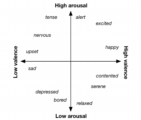
There are hundreds of emotions you could try to evoke, so it helps to think in terms of valence and arousal. Where does your store, where do your products fall within this graph? Where should it given your unique goals?
Let’s dive in.
1. Low Valence, High Arousal
Essentially, you’re evoking anxiety and intense negative emotions in your visitors. It’s a bold move that will only work selectively. For example, political campaigns and some charity ads will use low valence, high arousal copy and design to persuade visitors into action.
While risky, this works because of a little cognitive bias known as the negativity bias, which states that strong negative stimulus has a greater impact on psychological states and processes than strong positive stimulus.
Negative emotions also contribute to higher virality.
This tactic isn’t common in most ecommerce industries, so it’s on to the next quadrant.
2. High Valence, Low Arousal
When we talk about high valence, low arousal persuasion, we’re often talking about humor.
Humor is a persuasion technique because not only are your customers more likely to recall funny memories, but they’re more likely to share them as well. But why? Well:
- The element of surprise. Humor is often unexpected, it’s unusual.
- Humor distracts the brain from the fact that it’s being sold to.
- Laughing makes us happy. (Duh, right?)
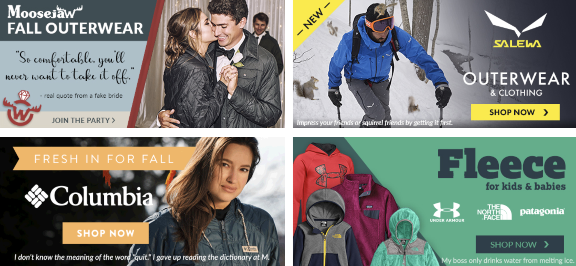
Moosejaw, an outdoor equipment retailer, is a perfect example of using humor to evoke strong emotion:
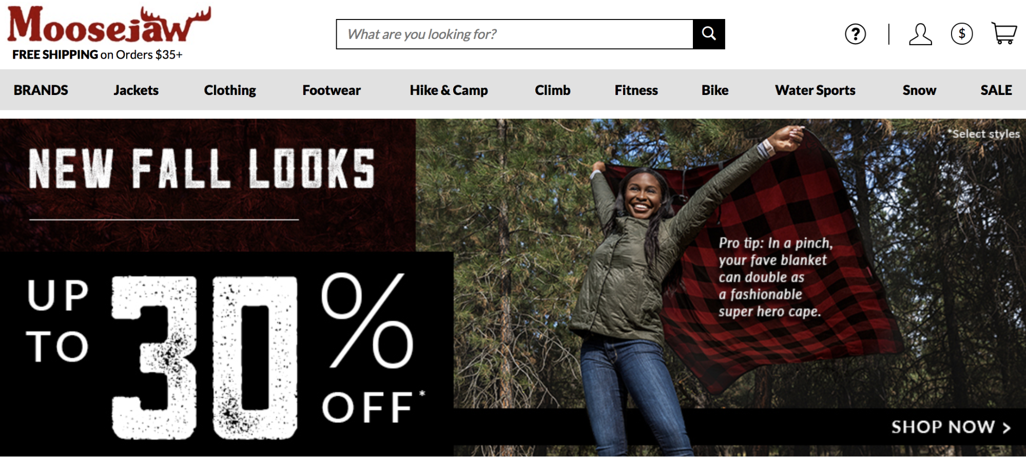
This persuasion technique extends even to their bite-sized on-site ads:
Chubbies, a shorts retailer, also comes to mind. From the homepage:
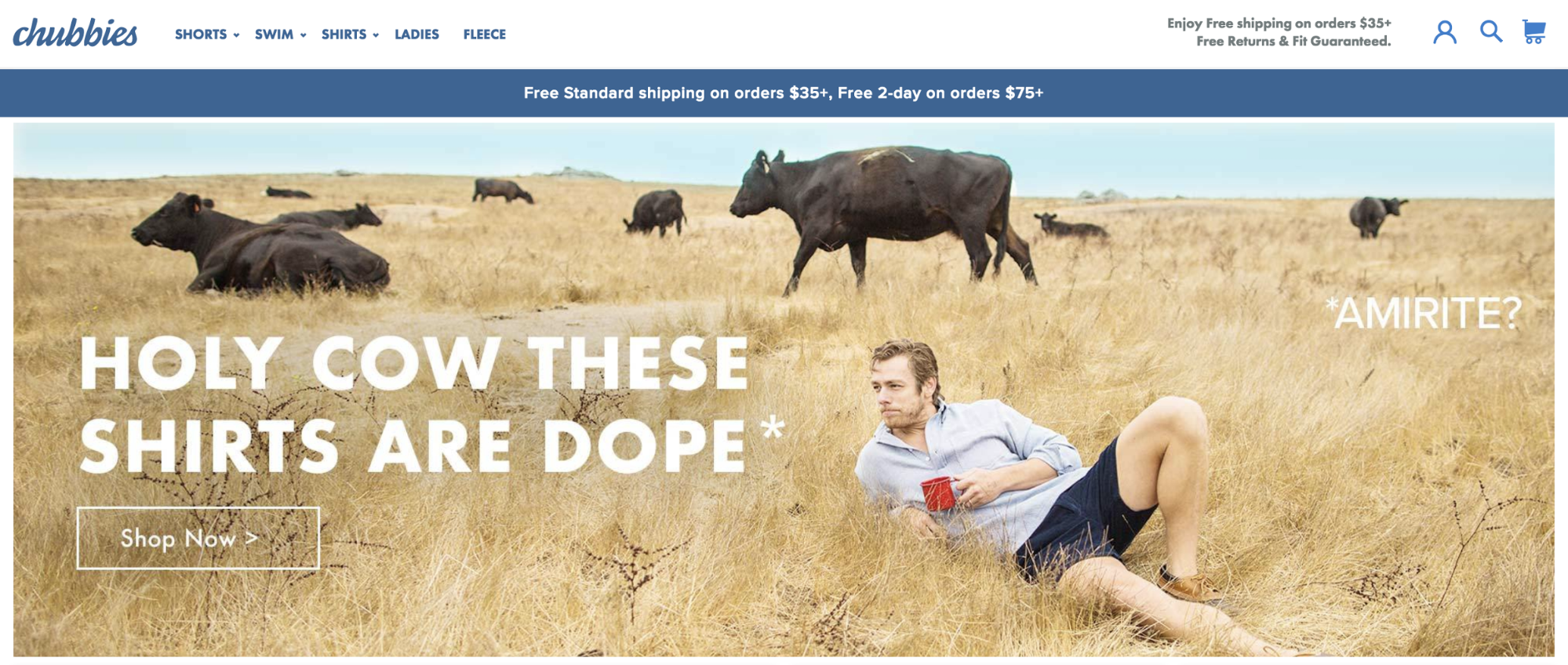
To the product pages:

Chubbies just plain makes you laugh, and that isn’t just a branding strategy, it’s a conversion strategy, too.
3. Low Valence, Low Arousal
Sad, but calm. It may sound odd, but it’s actually quite a common technique. You see, sad people seek immediate gratification rather than long-term reward, even if the long-term reward is the more logical choice. Makes sense, right? They want to get back to happen as soon as possible.
So, as long as the price tag is small, your happy solution to something sad will seem almost irresistible.
Take Flex Watches, for example. They sell watches and donate 10% of the proceeds to a charity of your choice, depending on the watch selected. Here’s the page to purchase an animal rescue watch:
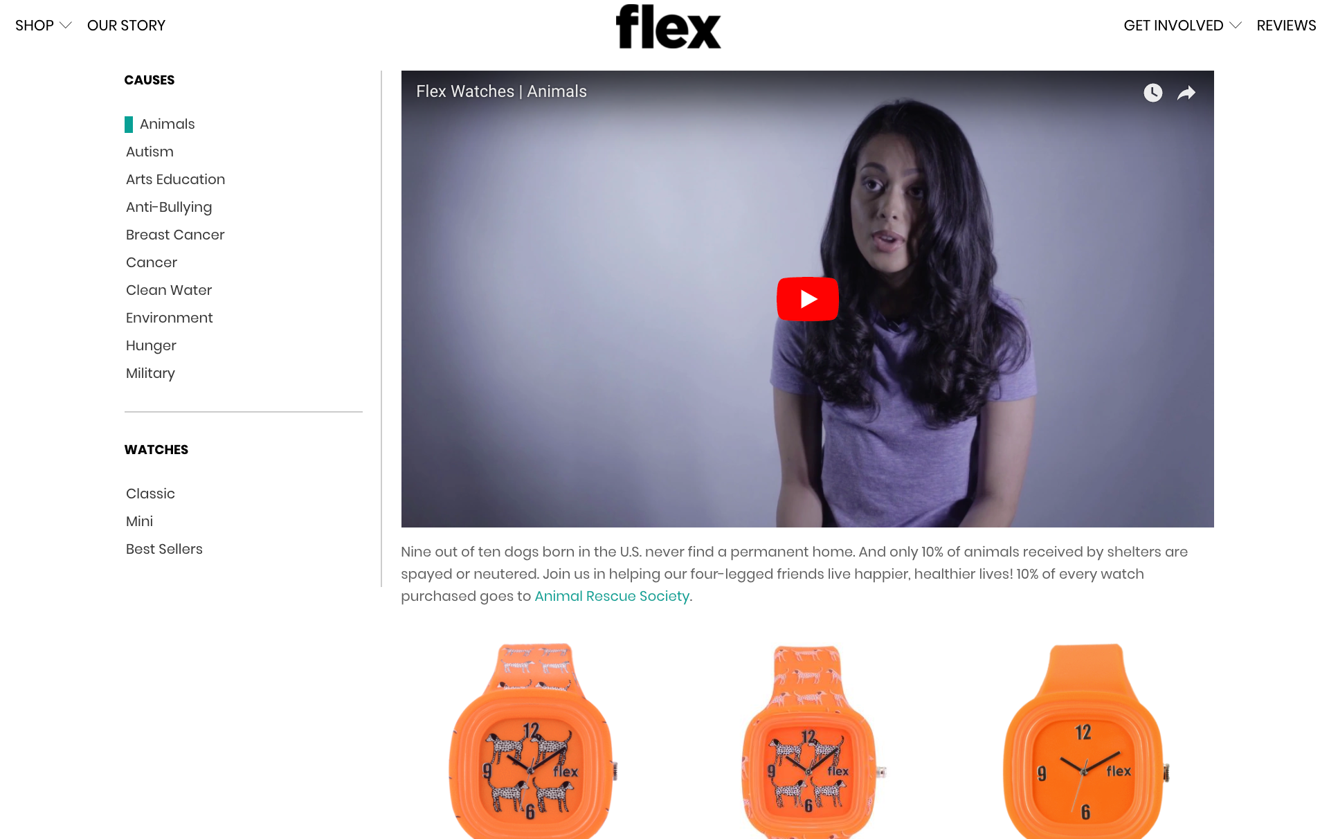
Nine out of ten dogs born in the U.S. never find a permanent home. Are you kidding me? Right in the feels. That would make just about anyone sad and it’s just one of the surprising animal facts in the video.
If you could spend $35 to help (plus get a new watch)? Seems like an easy choice.
Or consider the World Wildlife Fund store, which gives you the facts about endangered species and lets you choose how and where to help:
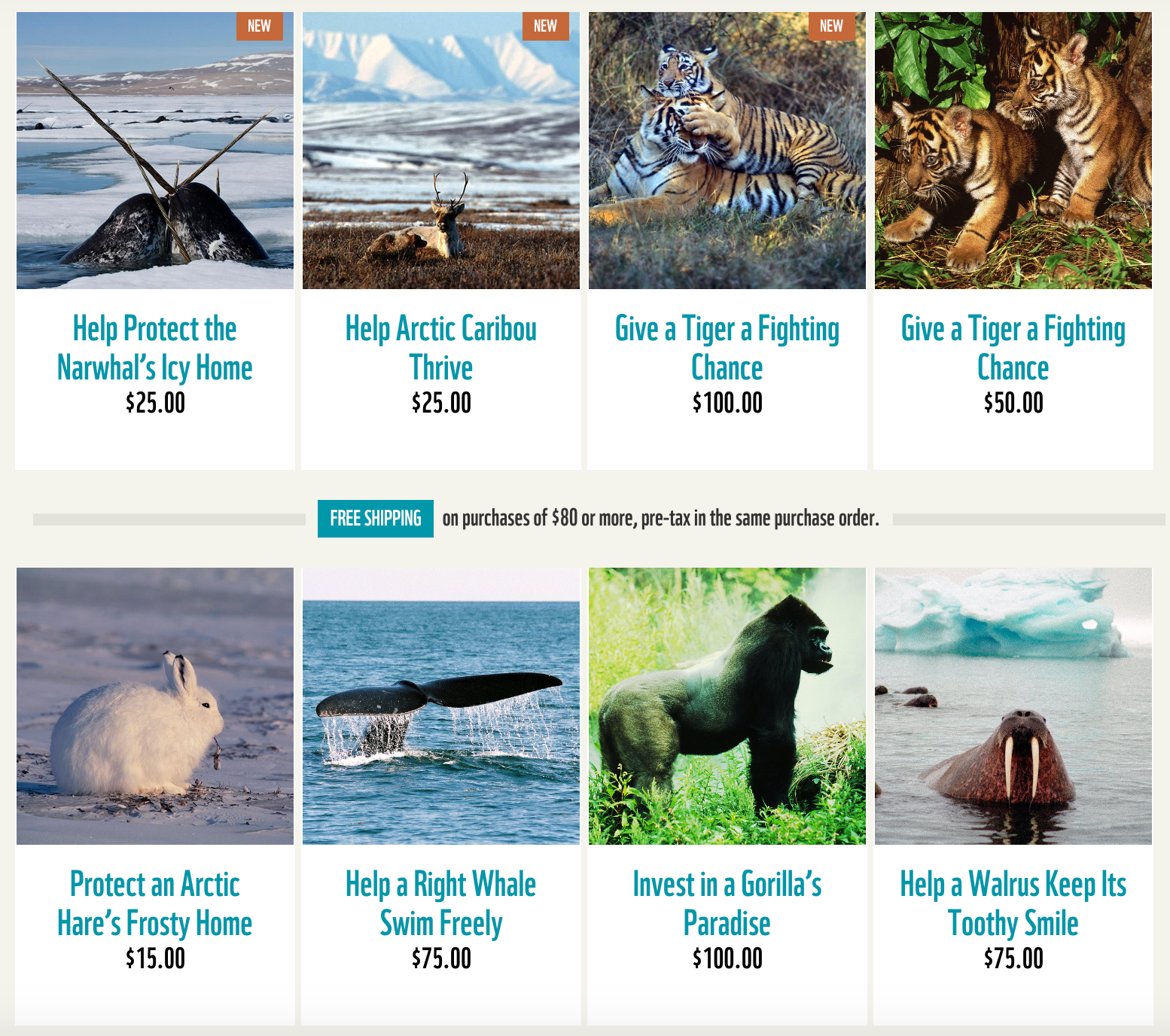
These differ from the uncommon low valence, high arousal technique because while they evoke sadness, they’re inactive. Contrast an active depiction of outright animal abuse with WWF’s more inactive technique, for example.
4. High Valence, High Arousal
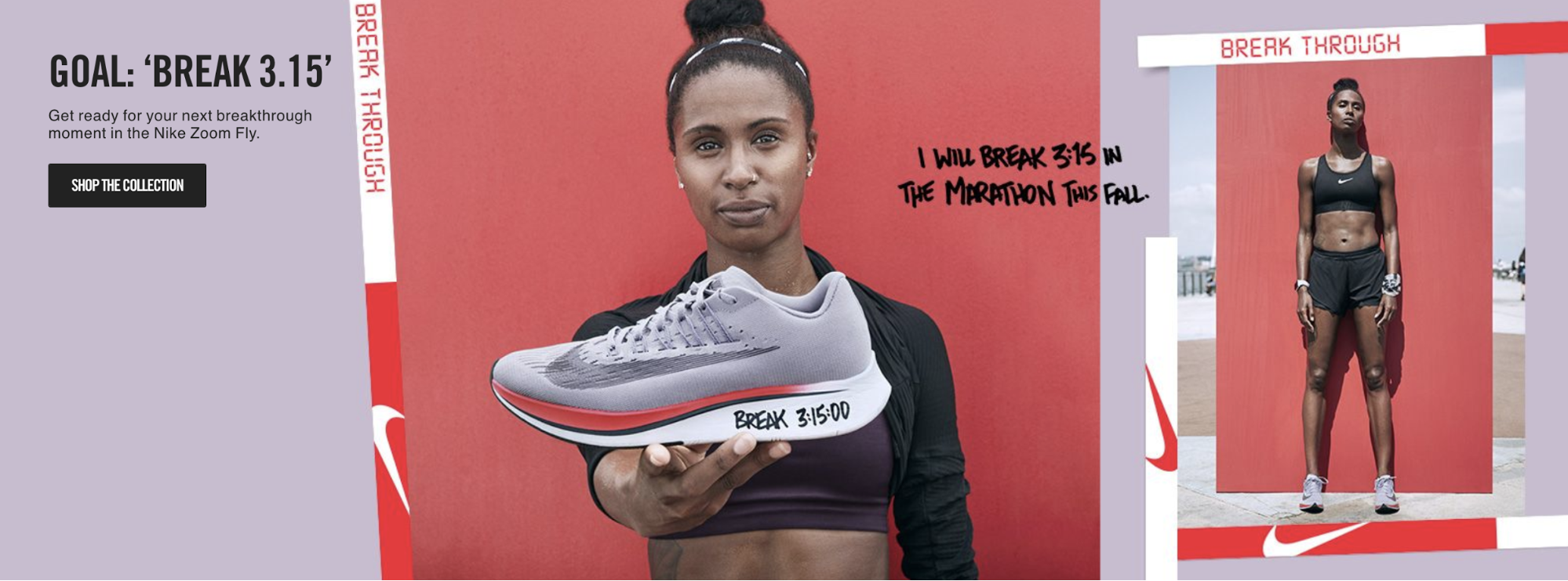
Anything that captivates an audience or inspires falls into this quadrant. This can include any stores that encourage you to be your best self, to adopt a new positive action.
Athletic apparel brands like Nike spring to mind, of course:
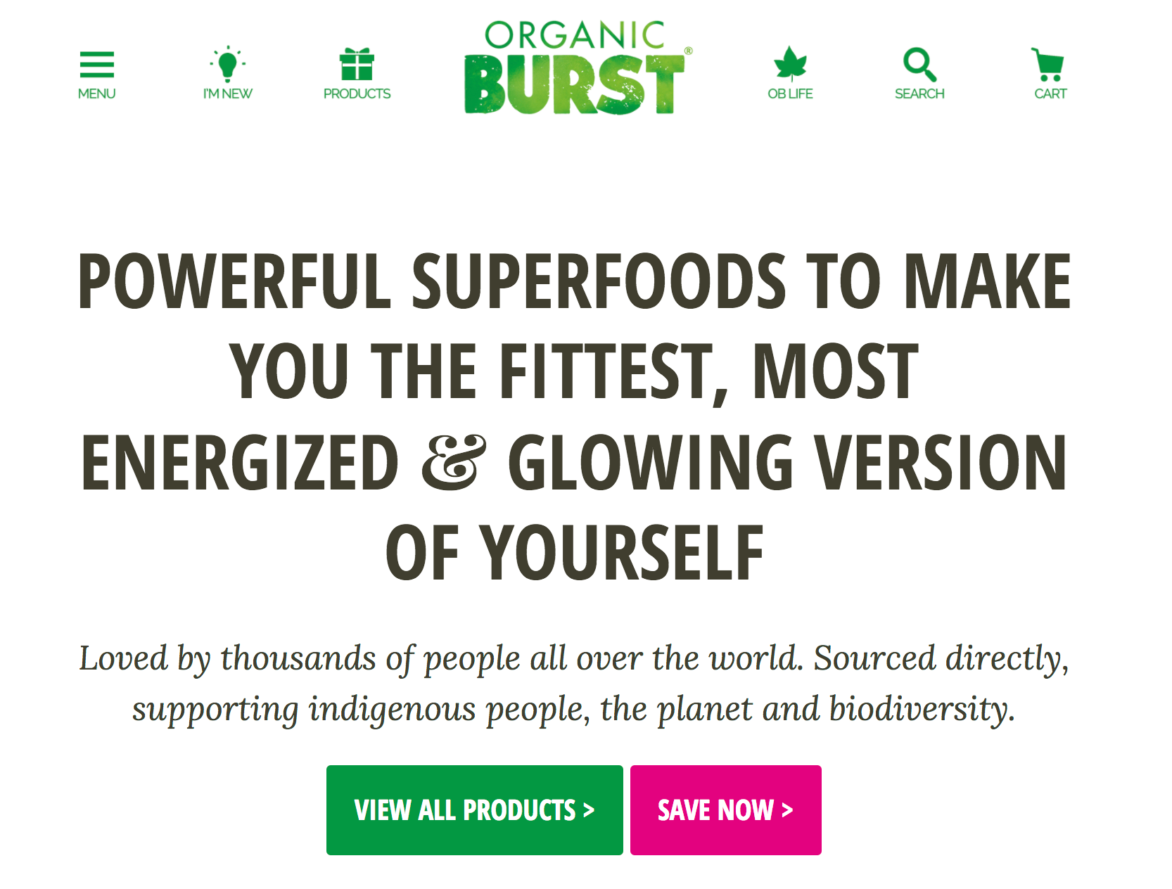
As do healthy living brands like Organic Burst. Their homepage promises to transform you into your most fit, most energetic, most positive version of yourself:
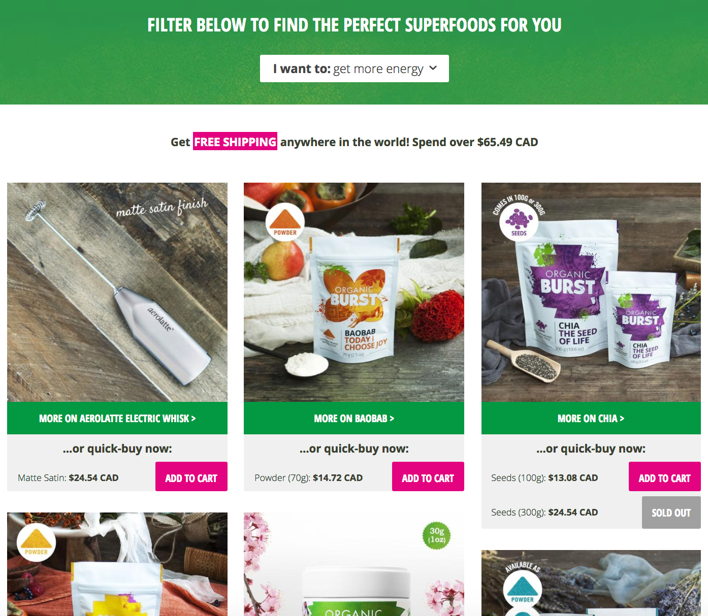
And their product filtering puts the products designed to transform you into your healthiest self front and center:
Inspiring active happiness and positivity? Not a bad route. Have you ever read that you should focus on the benefit, not your product features? It’s a common persuasion prescription:
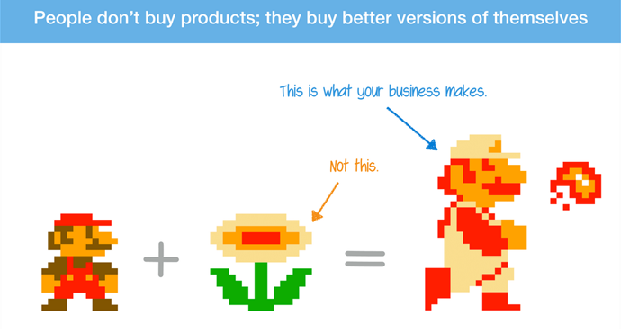
This is especially relevant for high valence, high arousal approaches.
How to Get Emotional Persuasion Right
Before you get started, there are a few more things you need to know. Emotions are tricky in general, let alone as a persuasion tool.
Here’s how to get it right the first time (spare yourself the hard lessons).
1. Have a well-defined process.
Emotions are messy and complex, which is why a clearly defined process to guide you is even more essential than usual. You know the basics, you’ve seen some examples, but it’s not enough.
You need to know how to apply emotional persuasion techniques to your specific audience.
Talia Wolf of GetUplift.co happens to be a leading expert on emotional persuasion. Fortunately, she was willing to share her four step process with me:
Talia Wolf, GetUplift.co
"The emotional targeting methodology I've developed is based on 4 main steps:
1. Who is our customer? In this stage our goal is to get into our customer's head. Understand her emotional drivers, concerns, motivations and real intent. To do that we use heatmaps, Google Analytics and other analytical tools to identify our customer's behavior on every page of the store. We run customer surveys and interviews, do voice of customer research, competitor research, emotional SWOT, and build the psychological profile of our customers.
2. What do we need to say to her? Once we've identified our customer's emotional triggers, we build the strategy around it, the main messaging we want to use, map our the customer journey, create hypotheses for fixing the leaks in the funnel, and set our goals.
3. How are we going to say it? This is where persuasive design, consumer psychology and emotional triggers come to play. Using all the information and research we gathered, we choose the copy, psychological colors, cognitive biases, the social proof, the hero image and even the fonts we want to test to trigger those emotions.
4. The last step is A/B testing. Continuous optimization, reading the data and finding new ways to create persuasive customer journeys that solve our customer's pain and help our client's business grow."
You’ll notice this process looks a bit like the optimization and growth process, but with a focus on emotional persuasion and qualitative research (surveys, interviews, etc.):
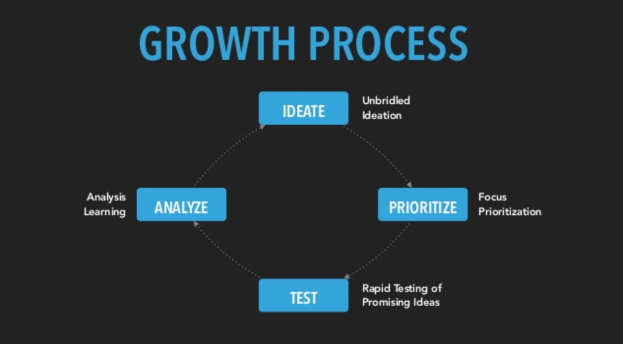
The emphasis on qualitative research allows you to become customer-driven instead of product-driven, which is important because what works for one store might not work for another.
High valence, high arousal might be a terrible choice for your store, for example. Or maybe just the way you implemented it will flop, but you’re in the right quadrant. Eliminating this uncertainty means conducting qualitative research.
Talia Wolf, GetUplift.co
"The most common mistake I see is businesses following best practices blindly. It's not enough to read a blog post about persuasion, download an eBook about it or follow ‘the one hack that persuades customers’. This method leads to marketers making assumptions about their customer vs. doing the heavy lifting and digging. Every audience is completely different and in order to create a high-converting persuasive website you need to build it around your audience, not a ‘best practice’."
2. Ensure copy and design work together to evoke emotion.
Emotional persuasion techniques can be divided into two categories: copy and design. Ideally, the two work together to tell one cohesive story and evoke a certain emotion.
Emotional persuasion in copy comes in two forms: emotion words and emotional storytelling.
Emotion words are also commonly known as emotional trigger words. Some words are inherently more emotional than others, so the specific words you select carry a lot of meaning.
For example:
- Private or secret: which is an emotion word?
- Fast or instant: which is an emotion word?
- Happy or carefree: which is an emotion word?
If you guessed secret, instant and carefree, you’re right. Here are some other emotion words you can use:
- Serene (high valence, low arousal).
- Uplifted (high valence, low arousal).
- Unburdened (high valence, low arousal).
- Light (high valence, low arousal).
- Meditative (high valence, low arousal).
- Centered (high valence, low arousal).
- Bold (high valence, high arousal).
- Brave (high valence, high arousal).
- Eager (high valence, high arousal).
- Daring (high valence, high arousal).
- Dynamic (high valence, high arousal).
- In the Zone (high valence, high arousal).
- Vulnerable (low valence, low arousal).
- Trapped (low valence, low arousal).
- Threatened (low valence, low arousal).
- Disempowered (low valence, low arousal).
- Insecure (low valence, low arousal).
- Paralyzed (low valence, low arousal).
Now, the point is not that a single word is going to skyrocket your conversion rate. It’s that some words are more likely to trigger emotion than others, which you can use to your advantage. Try to sprinkle emotion words throughout your copy. Remember, these are just examples. The best emotion words will come from your qualitative research.
Storytelling is another key component of emotionally persuasive copy.
Have you ever started a movie at home and felt compelled to watch it all the way through, even though you decided you hated it 30 minutes in? Or read a book all the way through, even though you stopped enjoying it on page 60?
Studies have proven that our brains are much more engaged by storytelling than facts.
You can use storytelling in a number of ways. Maybe you tell a story about how the product came about. Or you tell another customer’s story about your product. Or you help customers imagine their own story with your product.
It’s up to you, but a story is much more relatable than a brand. Think about movies like Get Out or Hidden Figures, which used storytelling and emotional persuasion to get their point across. Or think about companies that have built a loyal following thanks to their fearless protagonist, like Apple.
Emotional persuasion in design comes in three forms: font, color, and images.
- Are you familiar with the idea that it’s not what you say, it’s how you say it? Online, font is the how. The font you choose is impacting the emotions of your visitors, whether you realize it or not.
- The Internet is no stranger to the concept of color psychology. An incredible 62-90% of a visitor’s initial assessment of your store is based on color alone. 84.7% of consumers in a study said that color was the primary reason they purchased something. Let’s be clear, though, it’s not black and white. For example, yellow is considered a very happy color, right? But everything is contextual and color has to work with other emotional design factors, not alone.
- Arrows, hands and eyes can be used to direct attention. (One study found that hand-drawn arrows do this best.) Facial expressions can be used to evoke emotion. (After all, one person’s emotions can directly trigger the same emotions in someone else.) Contrast can draw attention to emotion words and images. The list goes on and on.
Again, what’s important here is that all of these factors work together. Copy and design cannot work in silos, color alone isn’t enough to emotionally persuade, etc.
3. Don’t set your sights too small.
Since you need all of the emotional persuasion techniques to work together simultaneously, you’ll likely end up with a variant that looks much different from your original store. This is a good thing. While you might be used to minor A/B tests, it makes more sense to go big in this case.
For example, A/B testing the introduction of a few emotion words or a button color change would be insignificant. Instead, you want to test an entirely new look and feel focused on evoking your desired emotion.
4. Get an emotional baseline.
How do your visitors feel when they visit your site on average? Look into this during your qualitative research phase so that you can get a baseline.
For example, someone visiting an outdoor apparel store might be feeling adventurous while someone visiting a bank’s site might be feeling stressed.
You want to evoke a specific emotion, right? You can’t do that as effectively if you don’t understand the average arrival emotion.
For example, let’s say you’re trying to make someone happy. You might take a different approach if they’re feeling sad, if they’re feeling mad, if they’re feeling stressed, etc.
Conclusion
Again, we’re emotional people making mostly emotional decisions. We might like to think otherwise, but our brains simply aren’t as rational and logical as we’d like to believe.
You can take advantage of that through emotional persuasion. Conduct your initial qualitative research first. Then get your copy and design elements working together to tell one cohesive story crafted to evoke specific emotions.
Let me know if you have any questions in the comments below. Also, I’d love to know your favorite example of emotional persuasion (in the ecommerce world and beyond).
