Lessons from 2 Months of Marketing Emails from a High-Growth Ecommerce Brand
From the pacing of your emails to how you bring fresh value to your subscribers' inboxes with every send, there's a lot to consider when building out your own email marketing strategy.
While you can always draw inspiration from what other global ecommerce brands are doing right, it can be hard to get a holistic view of what successful email marketing looks like long-term.
Last year, I took it upon myself to subscribe to the email lists of several top ecommerce brands, recording and analyzing every automated email I received over the course of 60 days. I even wrote up what I learned from Casper, a top player among online mattress companies, about effective email campaigns.
This time, I wanted to take a look at Birchbox, another major ecommerce brand in a completely different industry, to see what we can learn about how this subscription box company uses email to engage, educate, and upsell new prospects.
Birchbox’s approach to email marketing
Birchbox is considered the original monthly cosmetic subscription box. They’ve since become a notable and widely-used brand, working with larger cosmetics companies to distribute their products to hundreds of thousands of customers.
Their core business model is based on recurring revenue from a monthly cosmetics box. When people purchase subscription boxes, they are often looking to discover new products while still finding value from recognizable products.
Naturally, email seems to play a big role in promoting their monthly boxes and powering their subscription business.
I subscribed to various brands in order to create these tear downs, but Birchbox was one of very few that offered a “choose your own adventure” style of opt-in and asked for more information upfront. Most brands didn’t bother to segment their subscribers at the beginning, which can be a missed opportunity to serve them more relevant emails from the get-go. For this article, I opted for “Beauty” as my main interest from the two available options.
Before we dive into each email in detail, here’s an overview of the types of emails I received from Birchbox and when over the course of the 60 day period:
- Day 1: Welcome email
- Day 2: Seasonal promotion
- Day 5: Promotional email
- Day 8: Seasonal promotion
- Day 9: Promotional email (reminder)
- Day 11: Promotional email
- Day 12: Category promotional email
- Day 13: Welcome email (reminder)
- Day 15: Start of month promotional email
- Day 17: Subscription promotional email
- Day 18: Promotional email
- Day 19: Free gift promotional email
- Day 21: Special event email
- Day 22: Free gift promotional email
- Day 27: Special event email
- Day 33: Promotional email
- Day 40: Subscription promotional email
- Day 41: Partnership promotion
- Day 42: Free gift promotional email (reminder)
- Day 45: Promotional email
- Day 47: Start of month promotional email
- Day 54: Free gift promotional email
Shopify Academy Course: Ecommerce Email Marketing 101
Ecommerce expert Drew Sanocki shares his method for launching automated email marketing campaigns that build relationships and make sales.
Enroll for freeDay 1, Email 1: Welcome email
Subject line: “So Nice To Meet You!”
Preview text: “Beauty Made Easy: Finding new products is hard but it doesn’t have to be.”
Date: Mon, Feb 12, 2018 at 12:50 PM
Immediately after signing up for the “beauty” focus on Birchbox’s form I received this welcome email.
The beauty theme is evident and both the subject and preview copy feels spot on, with a well-balanced mix of friendly and educational. “Finding new products is hard but it doesn’t have to be” speaks to a core aspect of Birchbox’s value proposition in the preview text before you even open the email.
The aesthetic and layout are also consistent with the brand and website, using the same color palette and visual styles. The email is clearly crafted to make a strong first impression and get you excited about what Birchbox can do for you.
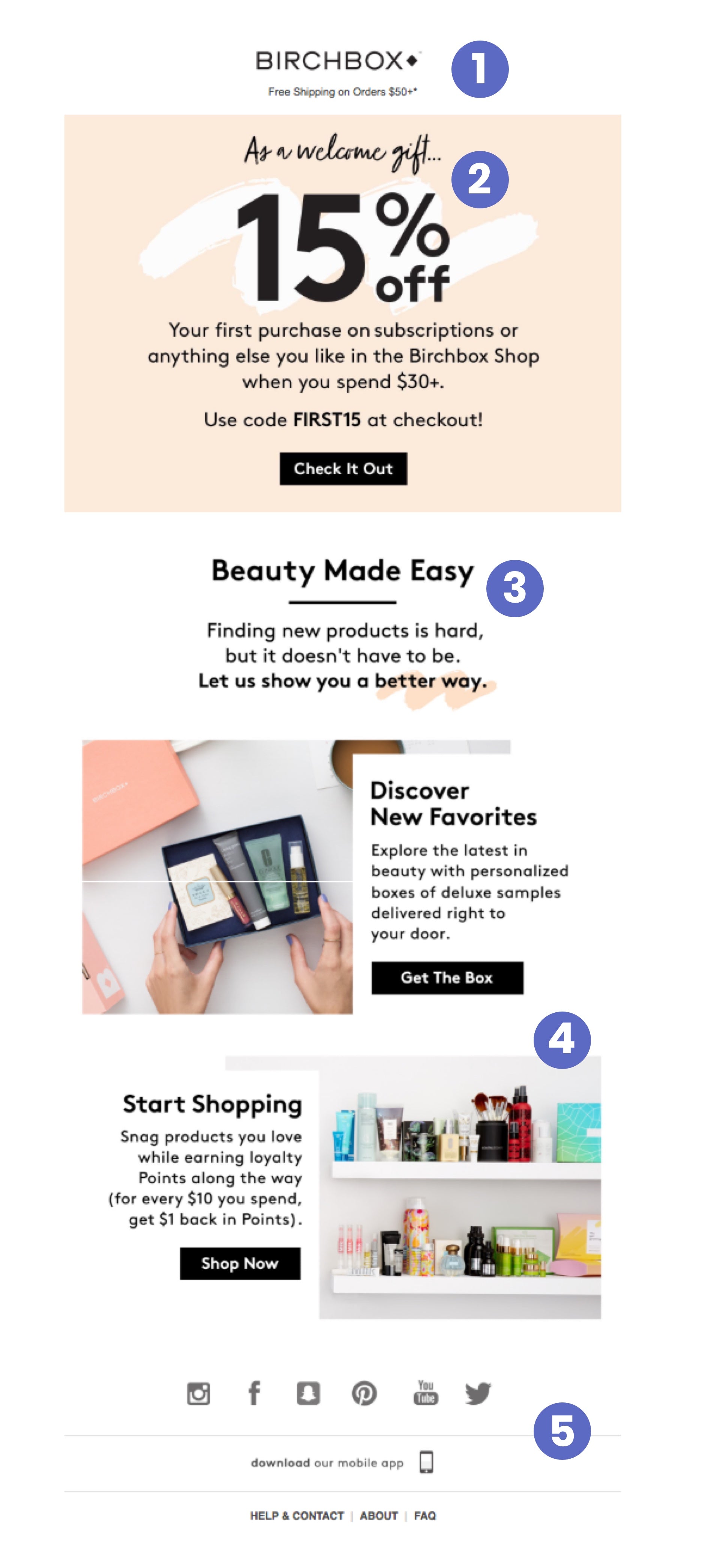
Teardown:
- Free shipping offer
Since this is a welcome email and I, a new prospect, might not be familiar with all the benefits of being a customer, adding a free shipping reminder at the top of the email provides an immediate incentive to consider their products.
- Welcome discount
A “welcome gift” is a friendly way to start the conversation with new subscribers. The 15% discount on orders is teased on the website before you opt in, and it’s a great way to not only incentivize opt-ins but encourage these subscribers to start adding products to their cart.
- Core benefit
This section is the first of three that introduce me to the core benefits of Birchbox. The simplicity of this section drives home their central message of “Beauty Made Easy”—that’s what Birchbox wants you to associate with their brand.
- Two starting points
These two sections are equal parts education for new prospective customers and call to action.The first caters to subscribers who want to use the service to try new products, and the the second is for those who know exactly what they want and are ready to save.
- Additional links in the footer
The first footer of the first email is a useful place for less urgent calls to action. Given our unfamiliarity with their brand, Birchbox nudges us to download their app and join the community. There are also direct links to customer support, their About Us page, and FAQs in case we need them.
Key takeaways:
- Take the opportunity to present your core value proposition in a story or journey format. “Value” to customers means something they can get excited about.
- Simple is better when creating associations with your brand. When customers encounter or talk about Your Brand, they should immediately think [uniquely valuable attribute].
- Don’t be afraid to show prospects where to start. Sometimes navigating a new brand can be challenging—especially if there are a lot of products and you aren’t sure what’s best for you. Guide them with simple cues, e.g. “Discover New Favorites,” “Get The Box,” and “Start Shopping.”
Day 2, Email 2: Seasonal promotion
Subject line: “Be Our (Early) Valentine with 20% Off Our Entire Site ❤️”
Preview text: “Get 20% off site-wide, including all gift subscriptions, with code BEMINE20. Birchbox”
Date: Tue, Feb 13, 2018 at 11:17 AM
The second email I received was sent February 13th, probably to avoid the deluge of day-of emails sent for Valentine’s Day. Birchbox may also have sent out additional emails prior to my joining their list to let prospects and customers know about the upcoming deal ahead of time.
Regardless, this is a great example of embracing seasonal events to remain relevant to subscribers throughout the year.
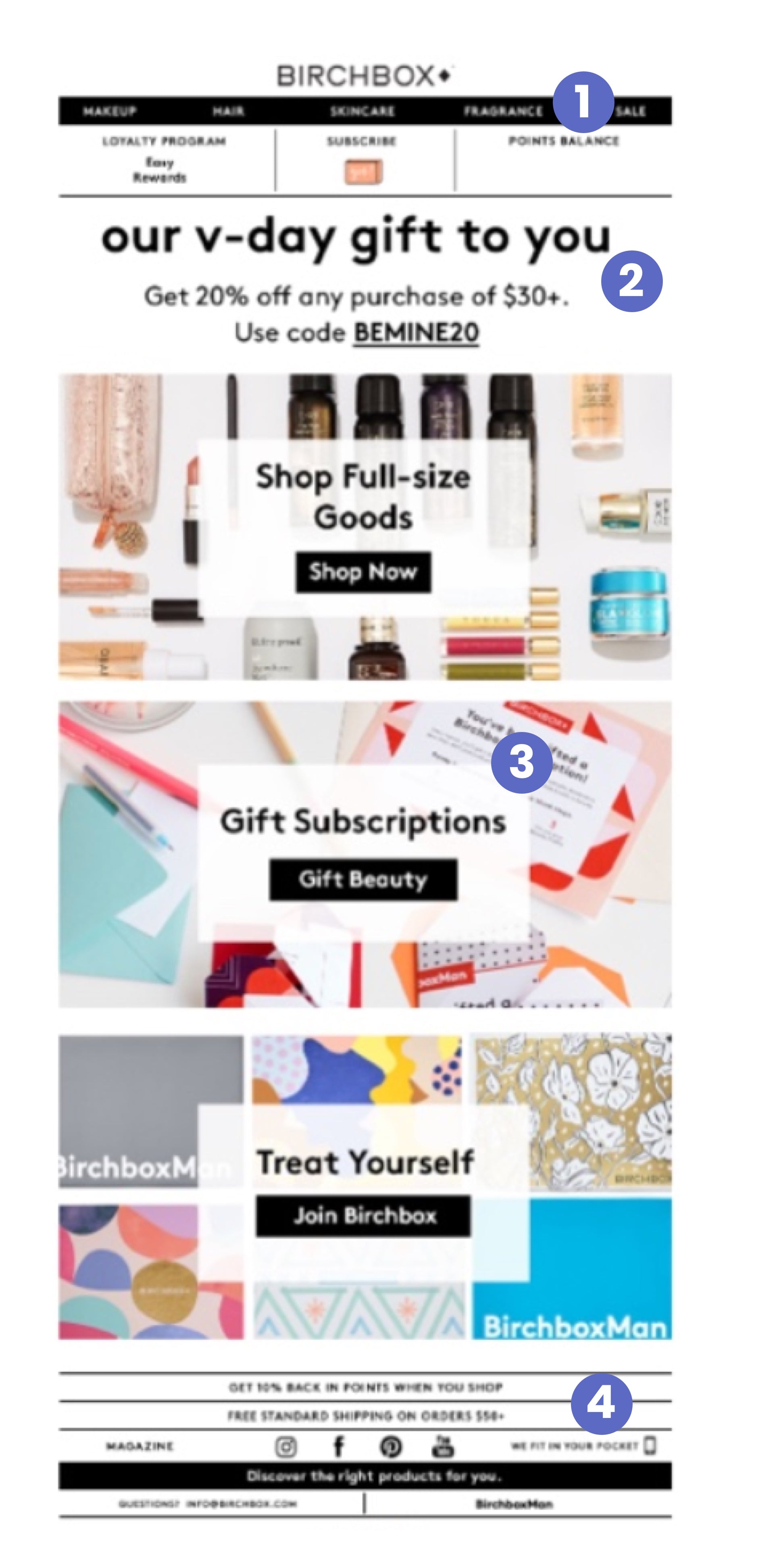
Teardown:
- Loyalty program incorporated in email template
Now that we’ve gotten past the welcome email, we’re presented with a new format that you will continue to see going forward. The header now centers on promoting their loyalty program, an initiative that encourages repeat purchases. They even display your current balance of loyalty points to encourage you to shop.
- Valentine's day offer
We continue to see casual and concise copy that speaks directly to the target audience. Once again, Birchbox positions their discount code as a “gift” to not only capture your interest but remind you that Valentine’s day is a time for gift-giving.
- Three ways to use their "gift"
The three call-to-action blocks in the middle of the email possess a consistent design with a context-specific background that fits each unique idea. Each of the three CTAs focuses on a different suggestion: make a one-off purchase of their full-sized offerings, gift a subscription to someone special, or get Birchbox’s monthly box for yourself.
- Additional resources in the footer
This email also has a new footer that highlights additional information about their loyalty program and offers a place for other less urgent links.
Key takeaways:
- When emailing a timely offer, like a Valentine’s day sale, consider preempting your competition by sending messages earlier than day of—this may help you avoid a crowded inbox.
- Think about offering suggestions on how to use your discount code (e.g. buy a gift for someone special) that appeal to your reader’s needs.
Day 5, Email 3: Promotional email
Subject line: “We Just Added 100+ Items to Our 40% Off Sale 😱”
Preview text: “Get 40% off over 100 just-added Sale items. Birchbox”
Date: Fri, Feb 16, 2018 at 11:54 AM
This email arrived a few days since I last heard from Birchbox, which felt well-paced and respectful of my inbox.
The subject line and preview copy include a specific number of sale items, which creates curiosity and an urge to explore what’s new. The email was sent around lunch time—maybe in hopes of catching prospective customers who are about to check their phones on their lunch break.
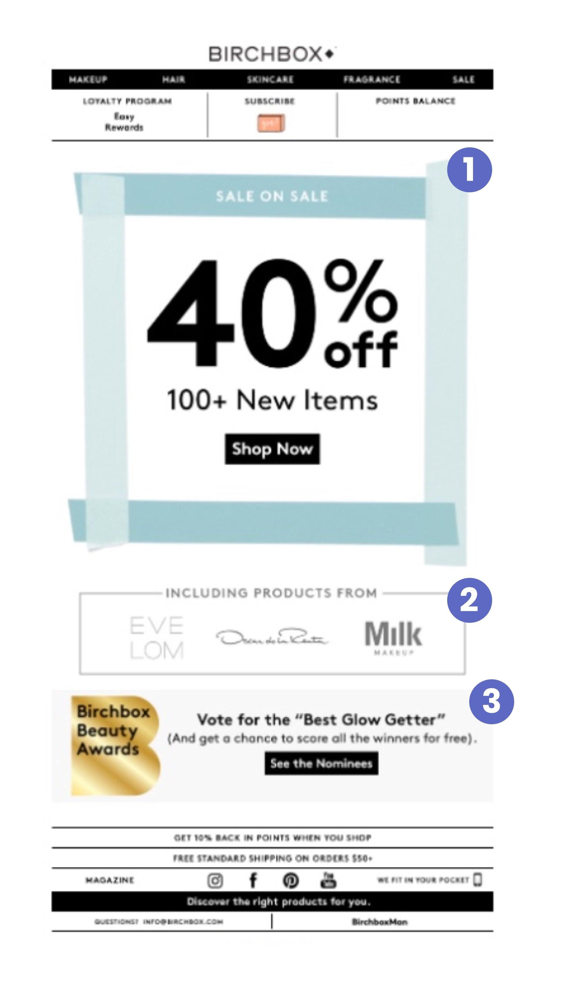
Teardown:
- Framed offer
The clean layout makes great use of the first block for a hero image, which is framed to naturally draw your eyes to the offer. The promotion itself is impossible to miss, and the copy below repeats the promise made in the subject line of “100+ New Items” on sale.
- Teaser
The lightly framed “Including products from” box provides another element of social proof—recognizable brands that instill trust through familiarity—while teasing some of the brands on offer in this new collection of products they’re promoting
- Community awards
The last section contains a separate but related CTA about their awards program, which does a good job of “showing, not telling” that their product curation process is community driven. It also gives subscribers a chance to have their voice heard if they want to share their thoughts about the products.
Key takeaways:
- If you’re creating sales or promotional offers, try to stay away from vague statements. Instead, use concrete numbers (like “100+ New Items”) when possible to stand apart from other emails in your customer’s inbox and offer specific value.
- Including social proof like brand logos or a community award programs incorporates a feeling of belonging to something bigger than an email list and generates more interest in your products. .
Day 8, Email 4: Seasonal promotion
Subject line: “Get a Free Benefit Mascara for National Lash Day 💁🏻”
Preview text: “Join Birchbox and get a FREE Benefit Cosmetics BADgal BANG! 36 Hour Full-Blast Volumizing Mascara - the newest out-of-this”
Date: Mon, Feb 19, 2018 at 10:00 AM
This email landed in my inbox at 10AM, which is still early but after I’ve archived my morning emails. Excellent promotional alignment being sent on National Lash Day: When seasonal events are niche-specific, you won’t have nearly as much competition.
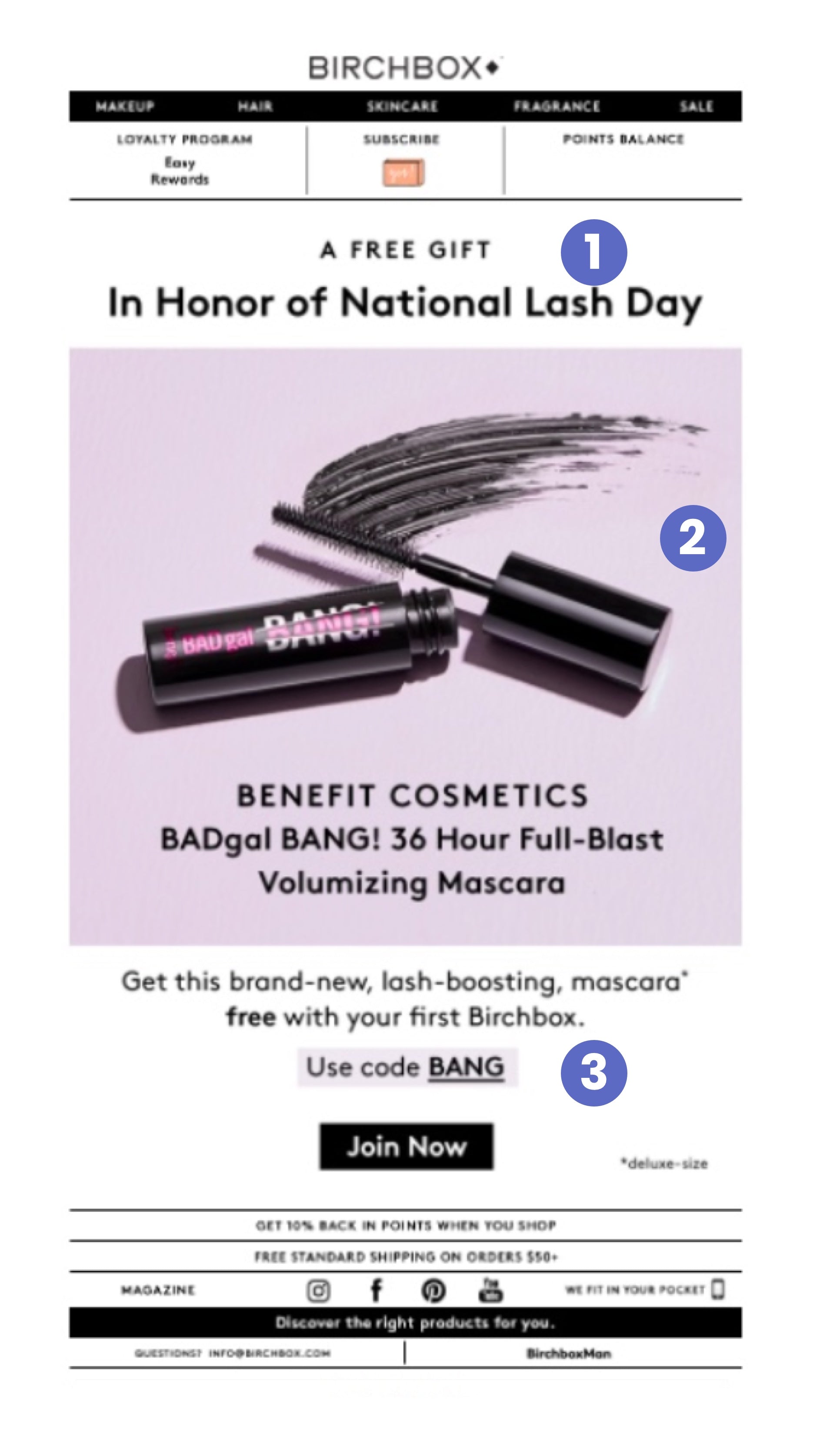
Teardown:
- Hashtag holiday promotion
Beyond the typical holiday marketing opportunities like Christmas or Valentine’s day, there are “social media holidays” like #NationalLashDay that you can jump on with a highly relevant product promotion. In this case, Birchbox offers mascara as a free gift with your purchase..
- Product action shot
The hero image is an action shot that exudes energy and personality, and it does a great job of creating excitement for the free gift. The copy shares more details about the product, underscoring its benefits.
- Highlighted offer code
The supporting copy explains how to get the free gift, using of a purple highlight over the code to draw your attention to it.
Key takeaways:
- Use special occasions, holidays, and real-world events to create relevant offers that appeal to your potential and current customers at that moment in time.
Day 9, Email 5: Promotional email (reminder)
Subject line: “40% Off Our Sale Category Ends Today”
Preview text: “Get 40% off over 100 just-added Sale items. Birchbox”
Date: Tue, Feb 20, 2018 at 12:01 PM
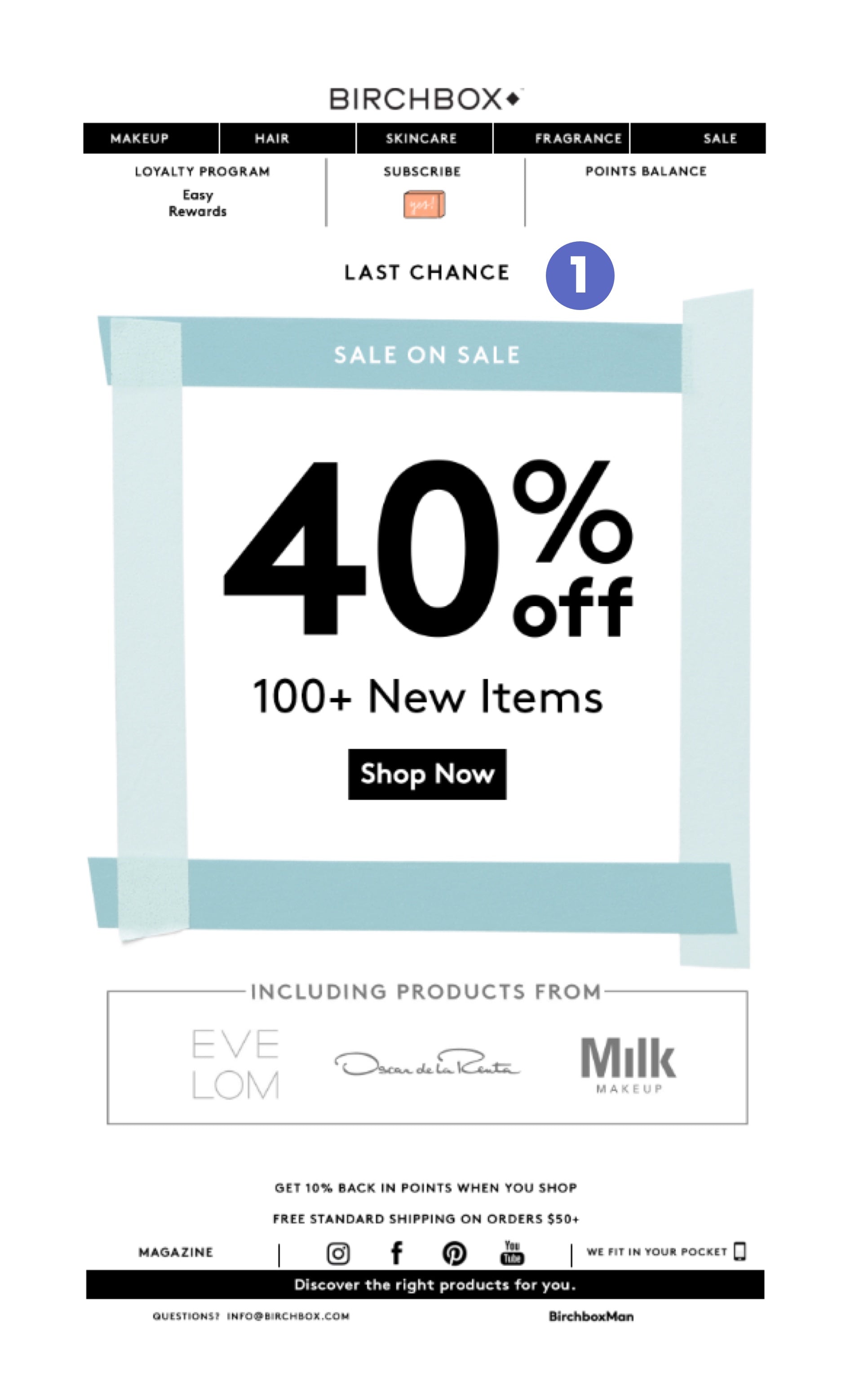
A tried-and-true tactic in email marketing is to always remind your customer of ongoing sales just before they expire.
You’ll typically want to update the subject and preview copy at least a little. In this case, I don’t think the preview copy was updated as it still reads “100 items were just added.” The design is similar, too. But this can be a good thing—you want it to be consistent with the first email so it isn’t confused for a brand new sale.
Tip: If you’re worried about emailing your entire list, create a segment of subscribers who opened but didn’t buy through the first email and only send the reminder to them.
Teardown:
- Urgency
There was only one small but important tweak in this follow-up email: the addition of “Last Chance” as a call to action at the top. It’s a .GIF that just toggles on and off like a light switch. The awards program banner from the previous email was also dropped to bring more focus to the sale.
Key takeaways:
- Sending out reminder emails to all customers, or customers who opened but didn’t buy, is usually a smart idea. However, this email could have emphasized urgency a bit more. Even a simple copy change to the main CTA, like “12 hours left to shop,” could further compel subscribers to take action.
Day 11, Email 6: Promotional email
Subject line: “Missing Our February Box Would Be 💔”
Preview text: “Join now before it’s too late to get your February Birchbox. Birchbox”
Date: Thu, Feb 22, 2018 at 1:07 PM
Since the core Birchbox business is the monthly subscription boxes, this subject and preview copy are spot on, and encourage me to subscribe now.
A consistent tone in subject lines can also coach subscribers to recognize a particular brand. Birchbox frequently adds a single emoji, but other stylistic approaches (e.g. no capitalization can be used, too.)
Teardown:
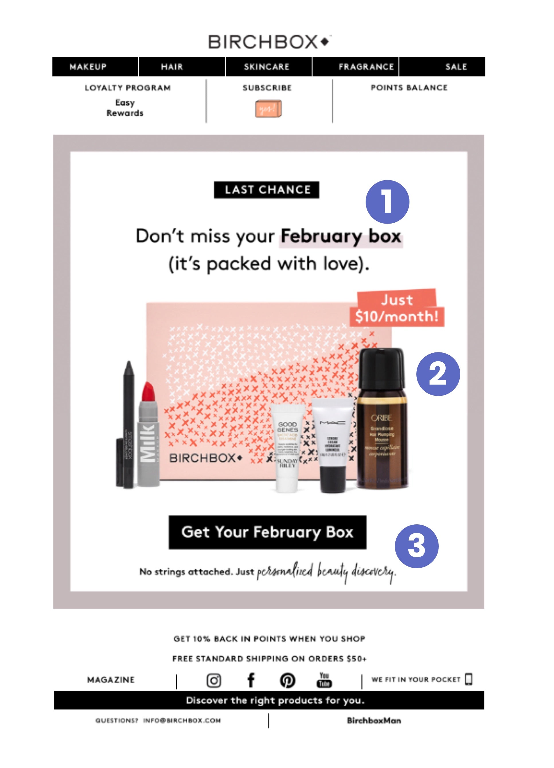
- Framed offer
Birchbox seems to be a fan of the “framed box” at the top of their promotional emails as a way to draw your focus and attention. Inside this frame, the copy is filled with language associated romance (“packed with love”, “no strings attached”). We’re coming off of Valentine’s day, after all.
- Staged product photography
The product image featured below showcases a Birchbox, book-ended by bright products on both sides. The banner in the top right, “Just $10/month”, feels like a sale sticker: an instant deal, and not a long term commitment.
- Personal call-to-action
The main call-to-action button is specific—you’re not just getting any old box, you’re getting your special February box. To further support the no-pressure, low-risk message, a single line of copy reiterates: “No strings attached.” Once again, making the decision to purchase feel simple and safe.
Key takeaways:
- Don’t be afraid to use emotional messaging to create a relationship and connection with prospective customers, especially in an industry that’s an intimate part of daily life.
- Think about the proximity of various elements and copy and how they work together to reinforce one another.
Day 12, Email 7: Category promotional email
Subject line: “20% Off Our Fragrance Edit Starts Now 👃”
Preview text: “Score 20% off a selection of fragrance finds from Juliette Has a Gun, TOCCA, and Clean a”
Date: Fri, Feb 23, 2018 at 1:21 PM
This is the seventh email in 12 days, which is a decent pace. Now, we’re being exposed to a specific collection of products through their fragrance category with a discount code to encourage us to shop.
Teardown:
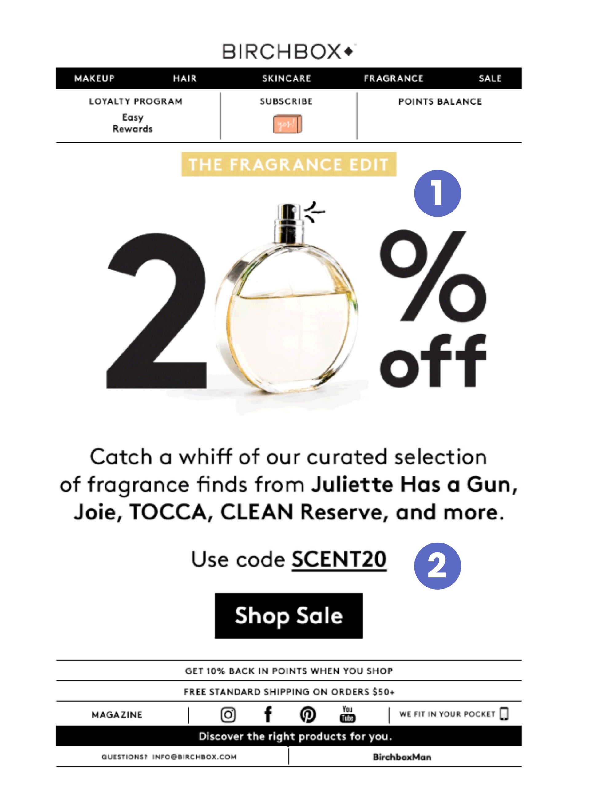
- Creative product photography
This excellent product shot incorporates the perfume as part of the promotional offer. This accomplishes two main objectives: showing off the product and drawing your attention to the sale.
- Creative copywriting
The copywriting here is terrific and aligned to the product/sale, making great use of sensory language like “whiff.” Birchbox again features popular brands to establish social proof by association, and features a simple code reminder and clear call-to-action right at the end the email. Note that the code itself (SCENT20) clearly communicates the product category it can be applied to.
Key takeaways:
- Engage the reader’s senses with your copy and design choices. Think about how you can involve their sense of taste, smell, or touch to craft a more captivating email.
Day 13, Email 8: Welcome email (reminder)
Subject line: “👋 Hey There, Your 15% Off Code Expires Soon!”
Preview text: “Join Birchbox for a fun new surprise every month. FREE SHIPPING ON ORDERS $50”
Date: Sat, Feb 24, 2018 at 7:01 AM
This email came pretty early on a Saturday morning. The wave emoji at the front of the subject line definitely helps catch the prospective customer’s attention in a friendly way. The email’s preview copy also highlights important information even before I’ve opened the email.
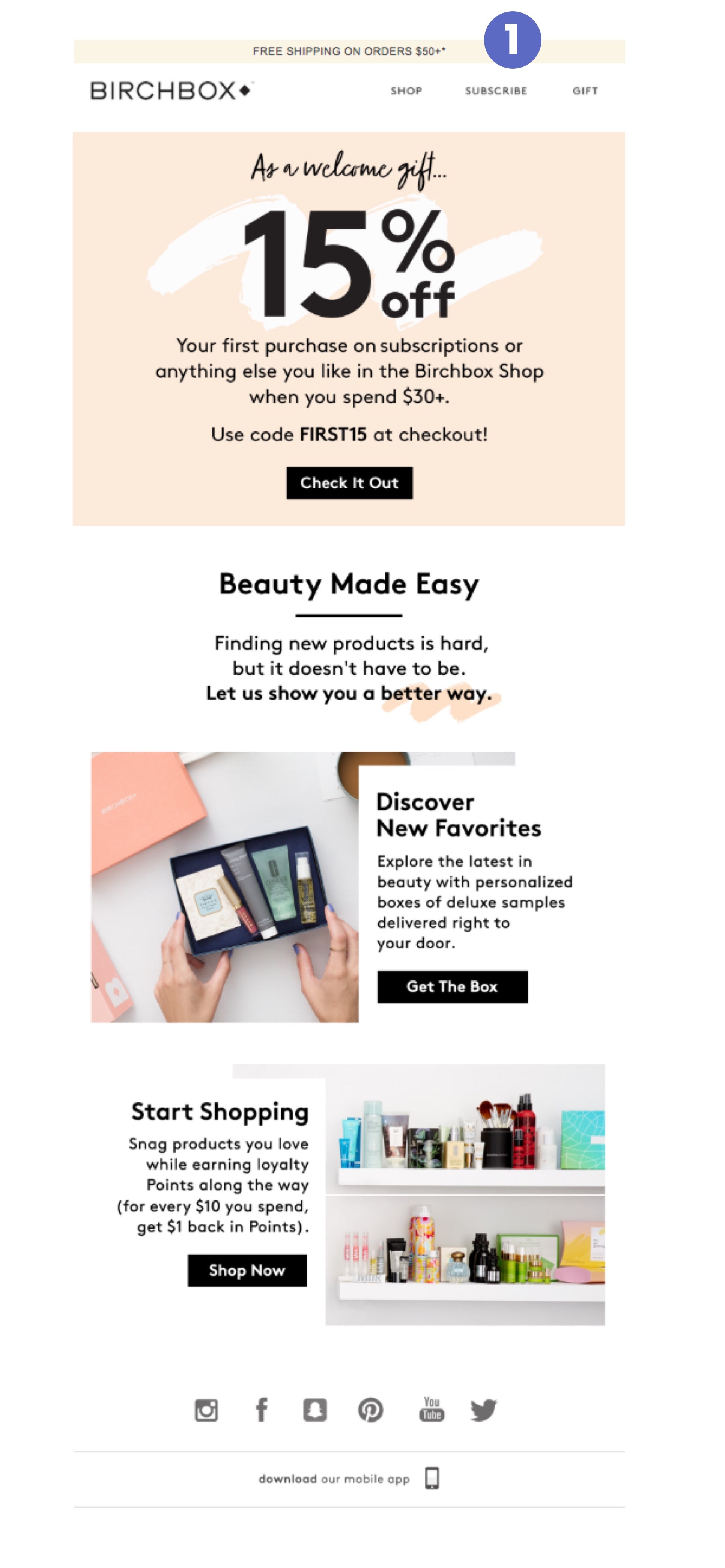
You should recall this design and structure from the very first email I received with a similar offer.
Teardown:
- Highlighted free shipping offer
It’s clear this is the same welcome email from when I signed up two weeks ago. The only significant change is the highlighted free shipping banner at the top of the email to nudge the subscriber to seize the offer while they can.
Key takeaways:
- Once again, sending reminder emails—especially before a code expires—is a useful way to increase your conversion rate from prospect to customer. People are busy and might miss or forget about your promotion the first time around, so don’t be afraid to remind your subscribers about special offers as they’re about to expire.
Day 15, Email 9: Start of month promotional email
Subject line: “Spring Is in the Air—Treat Yourself! ”
Preview text: “Join Birchbox for a fun, new surprise every month.”
Date: Mon, Feb 26, 2018 at 1:50 PM
This email was delivered a few days before the beginning of March, so the copy in the subject line and preview text well-timed to promote their next monthly box.
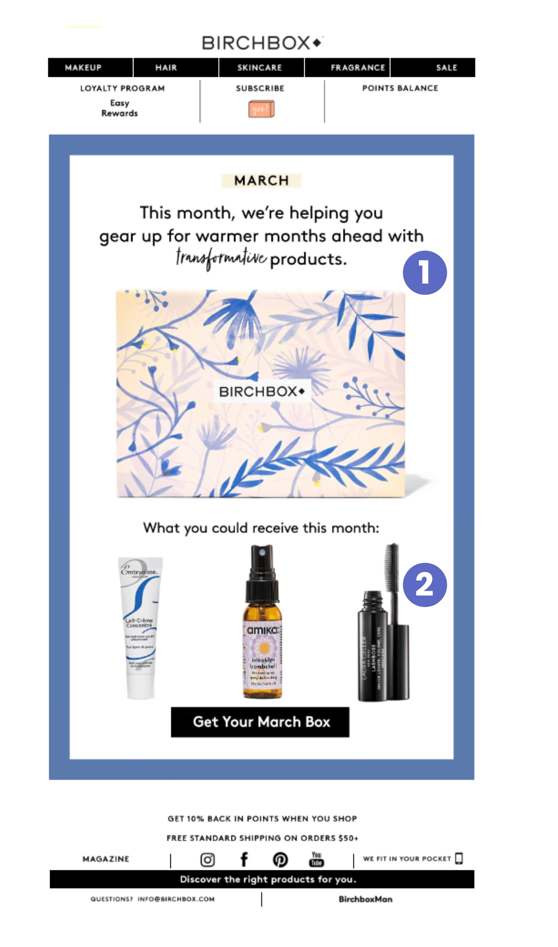
Teardown:
- Using contrast to focus your attention
We’re seeing the same framing technique from previous emails. The darker purple draws the eye and it compliments the main box in the middle by making it stand out. Spring is the season of change, and the copy highlights this with the use of the word “transformative” in a starkly different typeface.
- Visuals that inspire curiosity
This second half of the frame is a continuation of the purple box up top. The sentence “What you could receive this month” evokes an element of mystery and surprise— a key feature of subscription boxes. We’re then teased with the potential contents of the box. The call to action is once again as clear as it can be: “Get Your March Box.”
Key takeaways:
- Create moments of curiosity in your emails that encourage readers to click through.
Day 17, Email 10: Subscription promotional email
Subject line: “This Freebie = Your Night Out Essentials 💁”
Preview text: “Join Birchbox today and get a Birchbox-exclusive All Dressed Up set (including amika and”
Date: Wed, Feb 28, 2018 at 12:25 PM
This email arrived in the middle of the week (Wednesday) when people might start planning their Friday night out, which lines up with the subject line of the email.
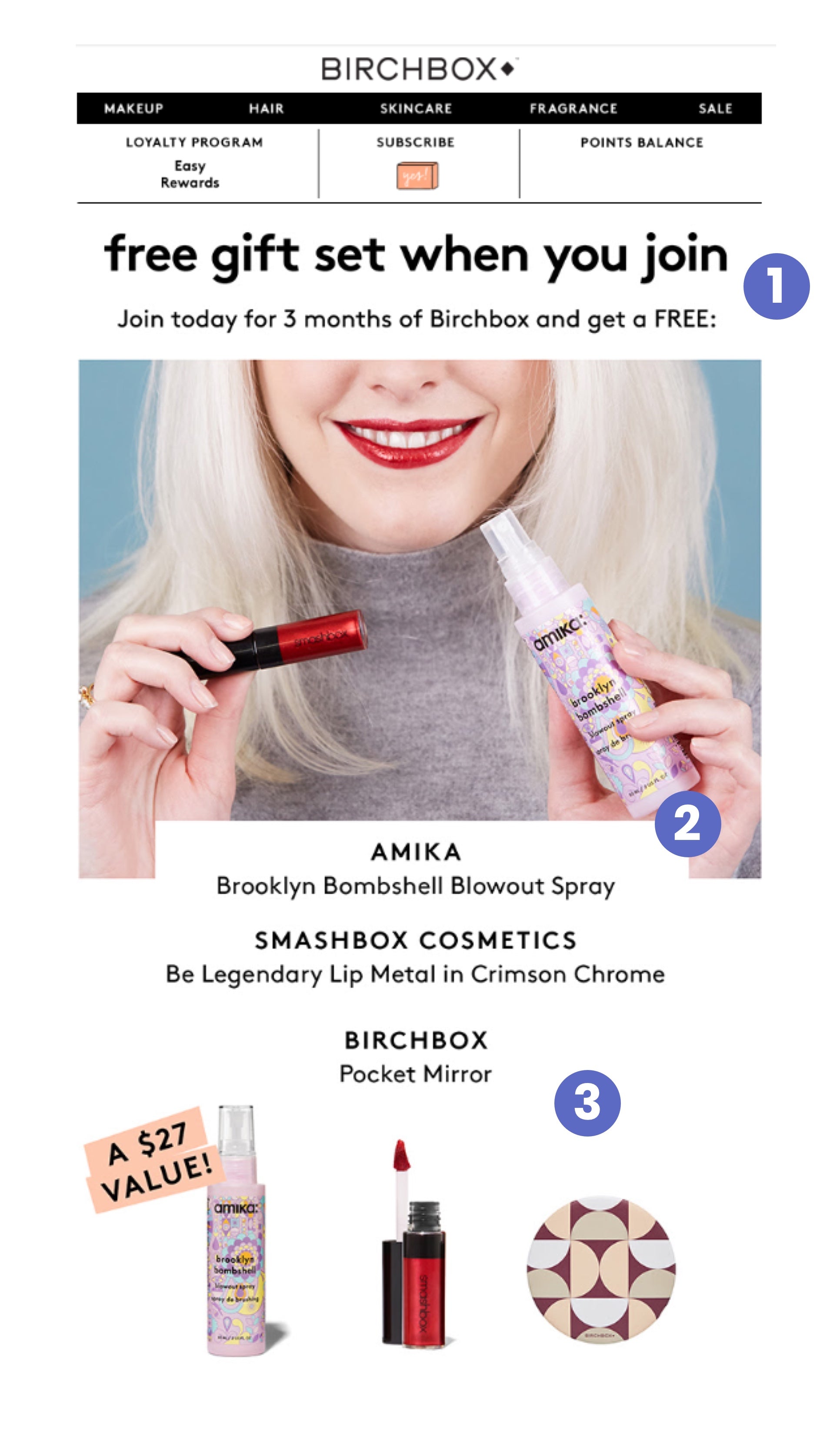
Teardown:
- Subscription bundle offer
The hero image offers a visual demonstration of two of the products included in the bundle. This is a compelling lead-in to the more traditional product photos below .
- Using white space to organize information
The white space in this email is used to organize the product information together. The way the white box cuts into the hero image above communicates to the reader that these two sections of the email are connected.
- Spelling out the value of the offer
“A $27 Value” explicitly lets me know what these products are worth on their own, and how much extra value I’m getting for free. It also subtly implies that a single product in this bundle on its own can almost make up the $30 cost of a 3-month subscription.
Key takeaways:
- Align your marketing strategy or promotions with your finances. If you can get customers to prepay for longer commitments or bigger value products, that’s less money you need to spend on acquiring new customers every month.
- Consider breaking down the retail price of your free gifts or items in a bundle to communicate the true value of your offers.
Day 18, Email 11: Promotional email
Subject line: “And the Beauty Awards Go to...🏆”
Preview text: “Join Birchbox for a fun, new surprise every month. Birchbox”
Date: Thu, Mar 1, 2018 at 11:30 AM
This email is a follow-up to the Beauty Awards contest we saw earlier. Birchbox uses it as an opportunity to encourage subscribers to shop based on the community’s favorite picks.
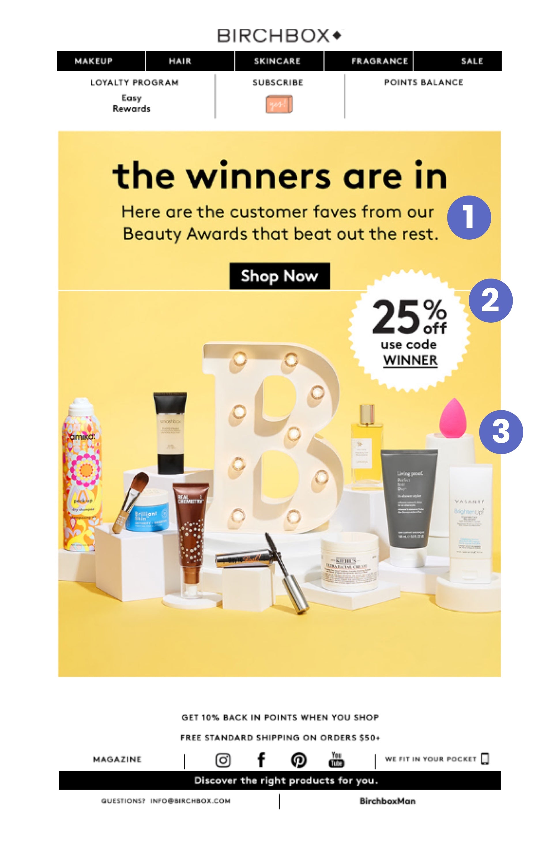
Teardown:
- Awards explanation
This email circles back to the Beauty Awards content we saw a few weeks ago. It offers a quick explanation/reminder if you need it.
As for the color palette, yellow can communicate excitement and honor, as well as associate gold with the idea of “winners”.
- Award-style discount offer
The ribbon-shape with the 25% off coupon is in close proximity to the main call to action, so it’s hard to miss for any subscribers who are interested in browsing these community picks.
- Strategic product photography
The bright yellow header image not only teases the winners, but puts them on literal pedestals to convey that these are some of their best products.
These products, some of which are pictured, are going to be the best of the bunch. So if there was something you were meaning to try, this email encourages you to go for it.
Key takeaways:
- Creating a community-driven “Awards” or selection of your store’s products is an excellent way to foster engagement and incorporate multiple high-valuel sends into your email marketing programs.
Day 19, Email 12: Free gift promotional email
Subject line: “Your March Freebies Have Arrived 🙌”
Preview text: “Choose your free gift with purchase! Birchbox”
Date: Fri, Mar 2, 2018 at 11:29 AM
As this email goes to show, Birchbox seems to favor “gift with purchase” offers as a tactic for encouraging subscribers to try out their service.

Teardown:
- Scarcity creates urgency
The email immediately drives home the “While supplies last” message to compel subscribers to act quickly. The subject line is also very powerful: “Your March Freebies Have Arrived 🙌” . It makes me want to open this email ASAP to see what I’m getting.
- Choose your own offer
The “Pick your freebie” header is the focal point, and the copy is clever because it makes me, as a shopper, feel in control—I get to pick the reward I want most. If I was on the fence about buying, this is probably a good time to just try it.
Key takeaways:
- Another way to execute a “free gift with purchase” offer is to give the customer options. Craft copy that puts them in the driver’s seat and makes it feel like they are giving you their order, rather than you “selling” a specific product they might not want or need.
Day 21, Email 13: Special event email
Subject line: “We're Proud to Work With These Female-Founded Brands”
Preview text: “Meet the hard-working beauty heroes behind some of your favorite Birchbox”
Date: Sun, Mar 4, 2018 at 11:19 AM
On Thursday, March 8, 2018, it was International Women’s Day. Receiving this email on Sunday, March 4 ahead of time, and ahead of any promotions other brands may be sending, says that Birchbox wants to stay top-of-mind before the event.

Teardown:
- Quickly establishes the context
The email opens with an explanation of why you’re getting it, aligning the occasion to Birchbox as a company. The connection is clear so it doesn’t come across as merely hijacking a trend.
- Infographic-style design
This email reads almost like an infographic, encouraging you to continue scrolling for more. The buttons along the way are a nice touch and give the email a 3D effect that makes it pop.
- Mission-focused call-to-action
Only a small portion of this email is dedicated to shopping their products. Most of it is actually about inspiring their subscribers by showing off the successful women behind some of their brands, putting faces to logos..
Key takeaways:
- Selling, inspiring, and educating aren’t mutually exclusive goals in the emails you send. Think up clever ways you can build up your brand while building up demand for your products.
- When executing a marketing campaign around an event or cultural phenomenon, be sure to align your brand with itin a way that feels authentic .
Day 22, Email 14: Free gift promotional email
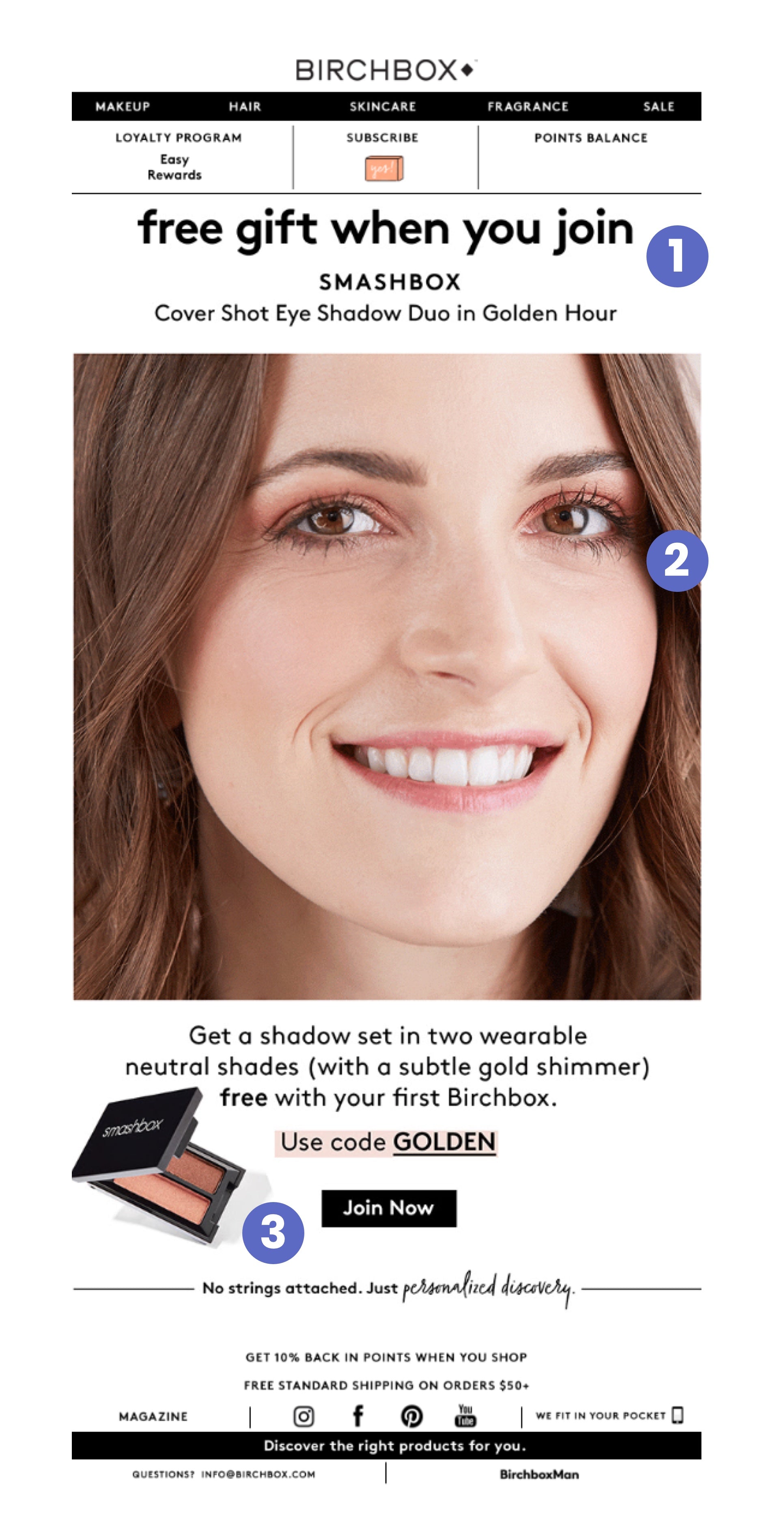
Subject line: “Your Free Smashbox Eye Shadow Duo Is Waiting...”
Preview text: “Join today and get a free Smashbox Cover Shot Eye Shadow Duo in Golden Hour.”
Date: Mon, Mar 5, 2018 at 12:36 PM
The timing of this offer felt a little strange to me as I just received the inspirational International Women’s Day email the day before. But once again we get offered a free gift if we make a purchase.
Teardown:
- Free gift focused headline
The Header copy “free gift when you join” is consistent with previous emails of this type.
- Friendly GIF
The large hero image is a GIF featuring a woman opening and closing her eyes, drawing attention to the product’s effect. The model is also smiling, which feels happy and friendly, unlike some more serious beauty advertisements.
- Gift proximity to call-to-action
We see the same effect of highlighting the coupon code as we’ve seen in previous emails with the product right next to the main call-to-action (CTA) button.
Key takeaways:
- If you have a strategy that works well, you can repeat it in fresh new ways instead of trying to reinvent the wheel every time.
Day 27, Email 15: Special event email
Subject line: “💸Want $5,000 to Follow Your Dreams?”
Preview text: “Women’s Day initiatives, from our Future Starts Now Fund to our inspiring video on women and”
Date: Thu, Mar 8, 2018 at 12:02 PM
This is the 15th email I’ve received in a month. That’s an average of 1 every 2 days, which some subscribers might see as a bit much.
This email was sent on International Women’s Day. The subject line is very appealing and speaks to subscriber wants, not company information. The aesthetic is brought back from the previous email, which makes both messages feel connected.

Teardown:
- Puts the cause first
The entire email is very inspirational and supportive of the larger event, with no shopping section at all this time. You can tell that this email is one piece of communication that is part of a much bigger campaign by Birchbox.
- Focus on brand purpose
Each headline is clear and speaks to the initiatives Birchbox is providing in support of women and the Birchbox community. Through actions, not words, Birchbox is communicated its brand purpose in this email.
Key takeaways:
- If you can launch an initiative, or partner with a larger cause, promoting those types of opportunities to your audience and community can go a long way—especially with a customer base that’s highly invested in those causes.
Day 33, Email 16: Promotional email
Subject line: “Two Birchboxes for $10? Yes, Please. 🤗”
Preview text: “Join Birchbox and get a free extra box with your first month’s delivery.”
Date: Wed, Mar 14, 2018 at 11:43 AM
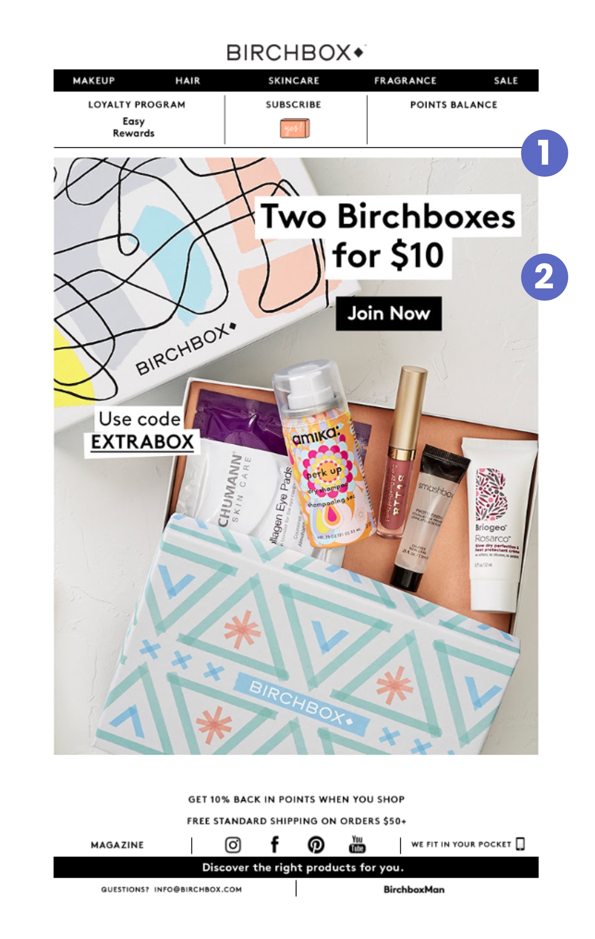
Teardown:
- Visualizing the BOGO offer
The offer promises double the value and the photo helps you visualize it.
The photo is a natural, almost amateur-ish shot that looks like an unboxing photo that’s ready to share on Instagram.
- Spelling out the value
There’s not much copy to discuss here—just the simple and straightforward “Two Birchboxes for $10”, the code and the button. Clear is often better than clever.
Key takeaways:
Don’t rely on copy alone to sell your offers. Visually illustrating their true value, as if it’s right in front of the customer, can make it even easier for them to take the leap.
Day 40, Email 17: Subscription promotional email
Subject line: “Three (Stila Lipsticks!) For Free ”
Preview text: “Join for three months of Birchbox and get a free Stila The Perfect Kiss Stay All Day Liquid Lipstick”
Date: Wed, Mar 21, 2018 at 12:01 PM
Even as we continue to see some recurring email formats, I like how Birchbox keeps their subject lines fresh and compelling without relying on the same tired copywriting formulas.
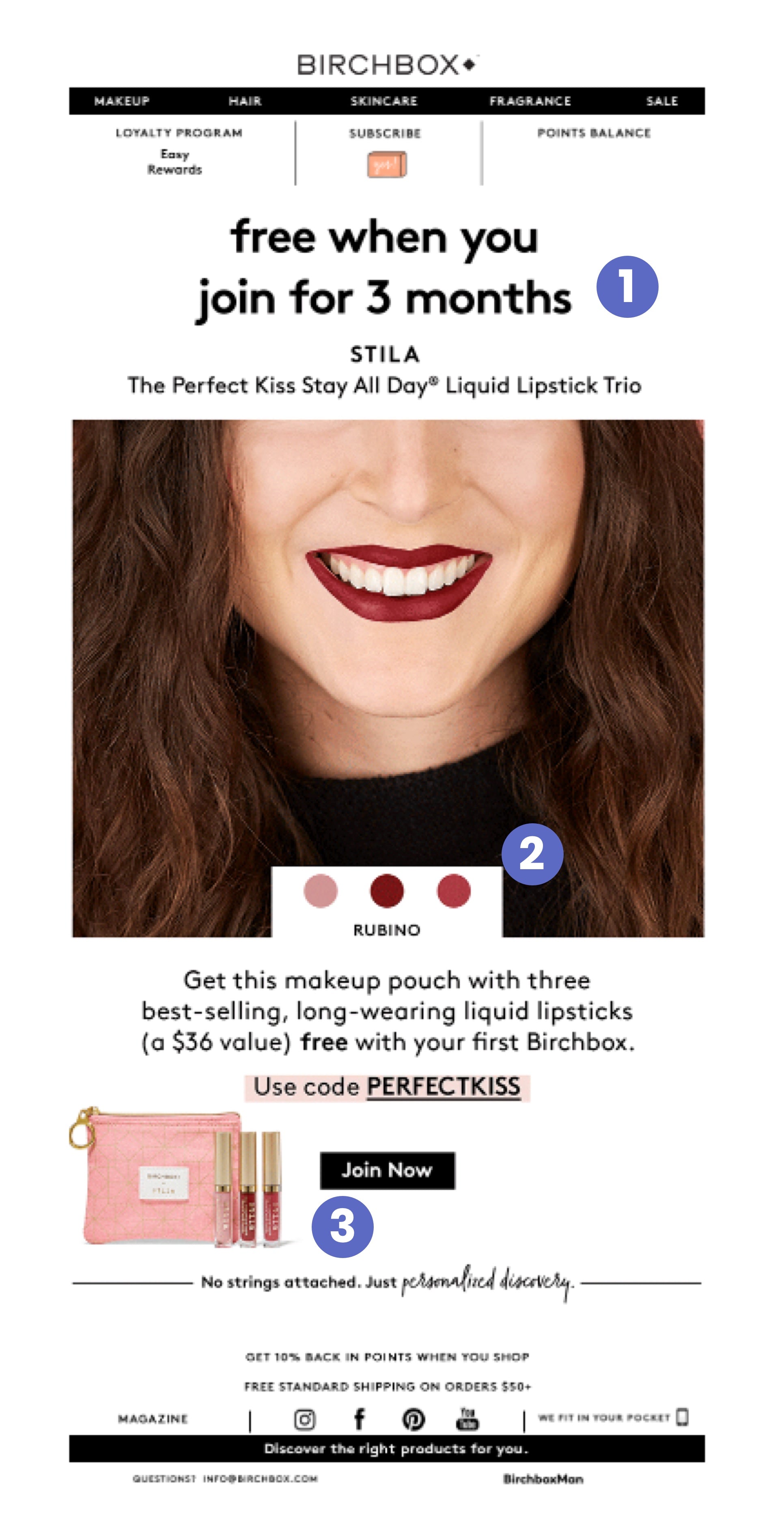
Teardown:
- Subscription bundle offer
Once more, we see a similar 3-month subscription offer, this time at the end of Q1. Maybe they’re looking for a final end-of-quarter sales bump?
- Interactive photo
We’ve seen this photography technique before—the GIF of the smiling woman with the shade of lipstick balanced by the same color at the bottom, white cut-in to draw attention to the center of the email. But this time, the lipstick color changes in sync with the color palette.
- Gift proximity to call-to-action
Again, everything you need to help you make a purchase decision is in one place.
Key takeaways:
- A “live demo,” or any approach that helps your customers visualize what the product is like and where it fits into their lives, can be a great way to keep customers invested in your email content and enter the consideration phase of a purchase decision..
Day 41, Email 18: Partnership promotion
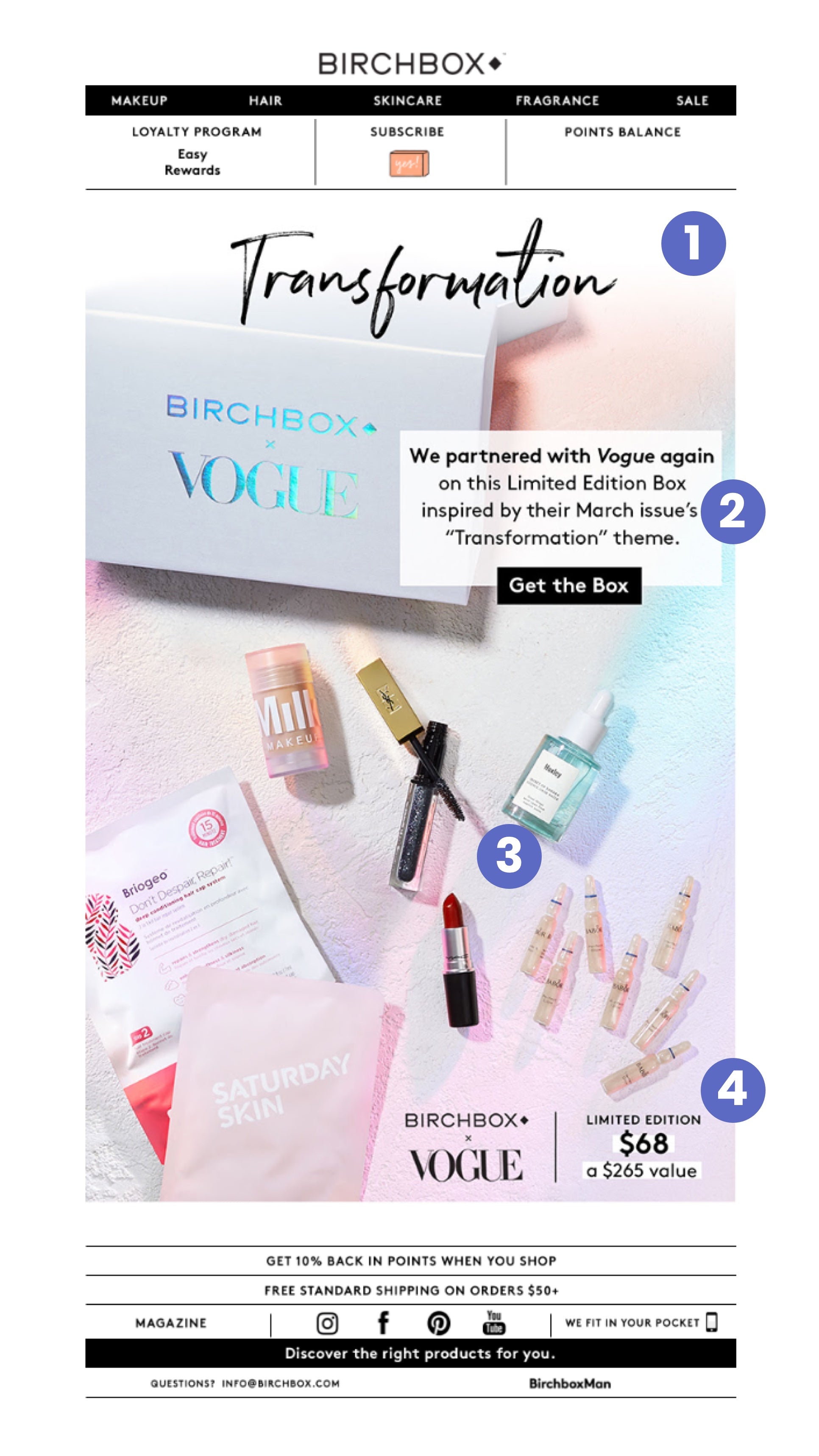
Subject line: “Our Second Limited Edition Box with Vogue Is Here”
Preview text: “Our second Birchbox x Vogue Limited Edition Box is finally here! Birchbox”
Date: Thu, Mar 22, 2018 at 2:24 PM
Teardown:
- Developing a branded vocabulary
There’s a lot in this email that’s visually different from anything we’ve seen so far. But one thing we have definitely seen before is the emphasis on the word “transformation”, which seems to be a central concept in Birchbox’s vocabulary.
- Unexpected call-to-action placement
Whereas most of their emails include the CTA at the bottom, here we see it at the top right, just next to the special Birchbox x Vogue box. This is likely due to the focus on visuals in the rest of the email.
- Magazine-style "page"
Since they’ve partnered with Vogue, the aesthetic here is also reminiscent of a page from a magazine. All of the products are laid out as such that you get the impression the box was sort of spilled out on the floor just in front of you, and there is no copy to get in the way of them
- Luxury brand value
In the bottom, right-hand corner, you see both brand logos which adds social proof and status. Immediately to the right of that I see the “Limited Edition” copy above the price of the box ($68). The price is higher than usual, but this is a luxury brand partnership. Birchbox makes sure to point out that what I’m getting is normally worth $265.
Key takeaways:
- Establishing partnerships are a great way to acquire new customers, leverage the equity of other brands, or test new product concepts (in this case, a premium box at a higher price point). Plus, you may even be able to multiply your reach, depending on the nature of the partnership.
Day 42, Email 19: Free gift promotional email (reminder)
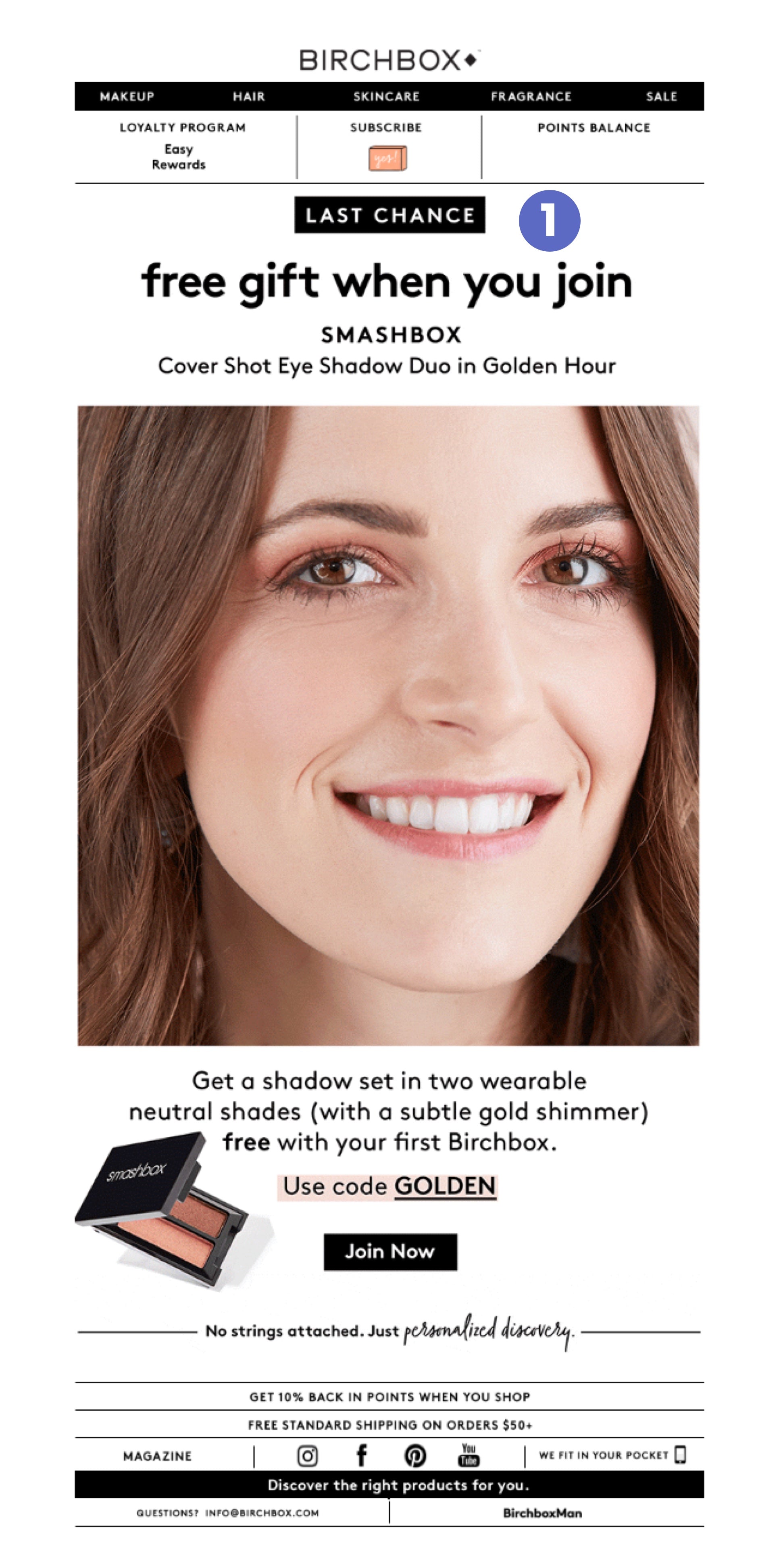
Subject line: “Last Chance for This Smashbox Freebie ✨”
Preview text: “Don’t miss your March Birchbox! Birchbox”
Date: Fri, Mar 23, 2018 at 11:39 AM
Teardown:
- Another reminder
This is the exact same email and offer as Day 22—in other words, a reminder email for the original free gift/offer that’s being sent 20 days later. The only significant update is the flashing “Last Chance” GIF at the top.
Key takeaways:
- Nothing new to add here. Most subscribers, even if you have an excellent open rate, won’t see or act on your emails, so sending reminders on offers can provide a second chance when used correctly.
Day 45, Email 20: Promotional email
Subject line: “Birchbox for $8 a Month = Best. Deal. Ever. 🙌”
Preview text: “Get an annual subscription to Birchbox at $96-just $8 a month. Birchbox”
Date: Mon, Mar 26, 2018 at 12:10 PM
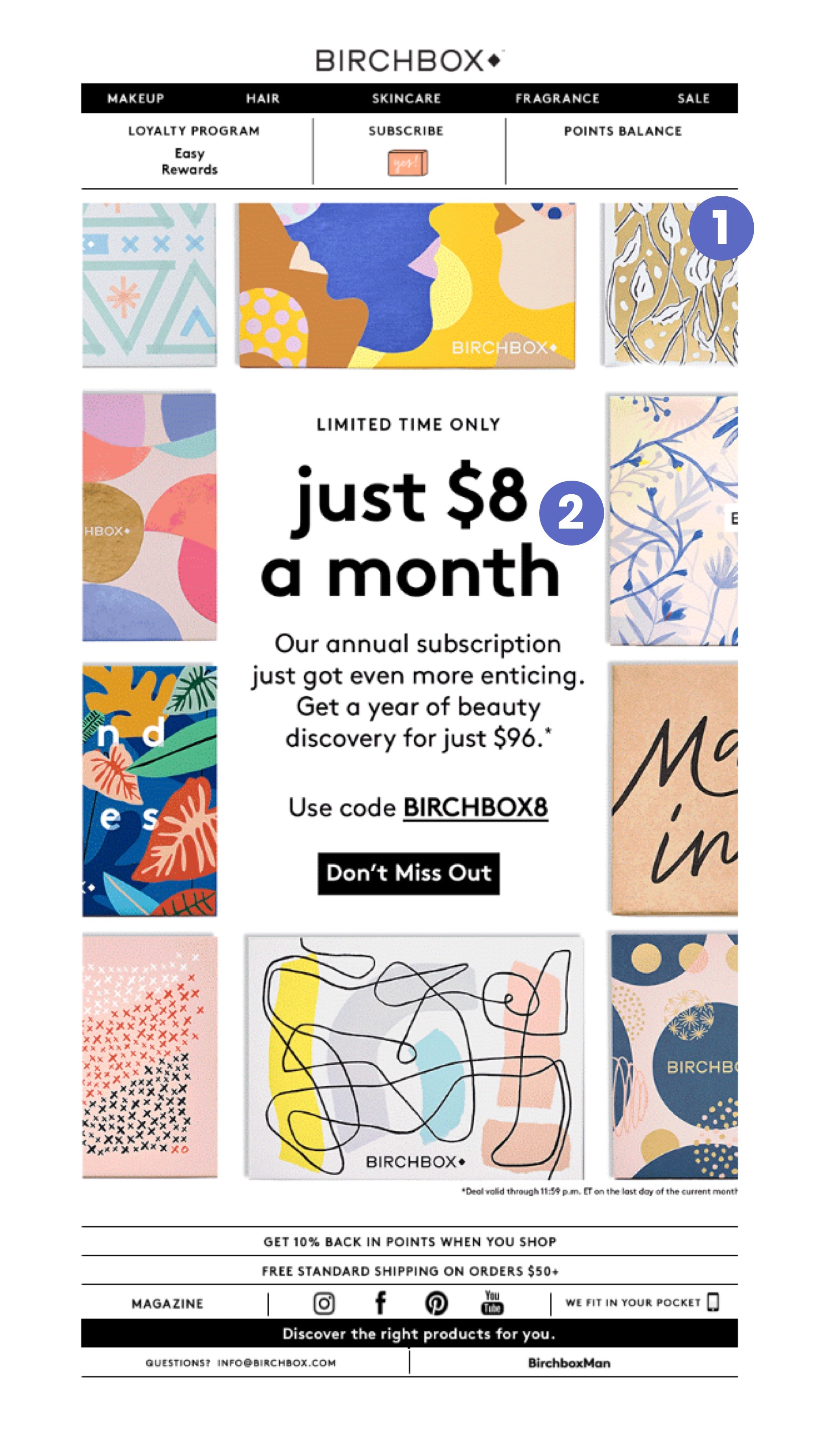
Teardown:
- Creative framing
This is a focused and fantastic-looking email. Create a frame out of various product photos communicates the sheer quantity and variety you would get from an annual subscription.
- Urgency meets low-risk
The uppercase “LIMITED TIME ONLY” creates a sense of urgency, while the casual simplicity of the lowercase “just $8 a month” communicates how little you stand to lose if you take the leap.
Key takeaways:
- Blend together different persuasive triggers to balance the pressure of urgency with the offer of an easy commitment.
Day 47, Email 21: Start of month promotional email
Subject line: “Our April Box Has Freshly Picked Products Just for You ”
Preview text: “Join Birchbox for a fun, new surprise every month. Birchbox”
Date: Wed, Mar 28, 2018 at 10:58 AM
Just like before, we get a teaser of the next subscription box during the last few days of the month.
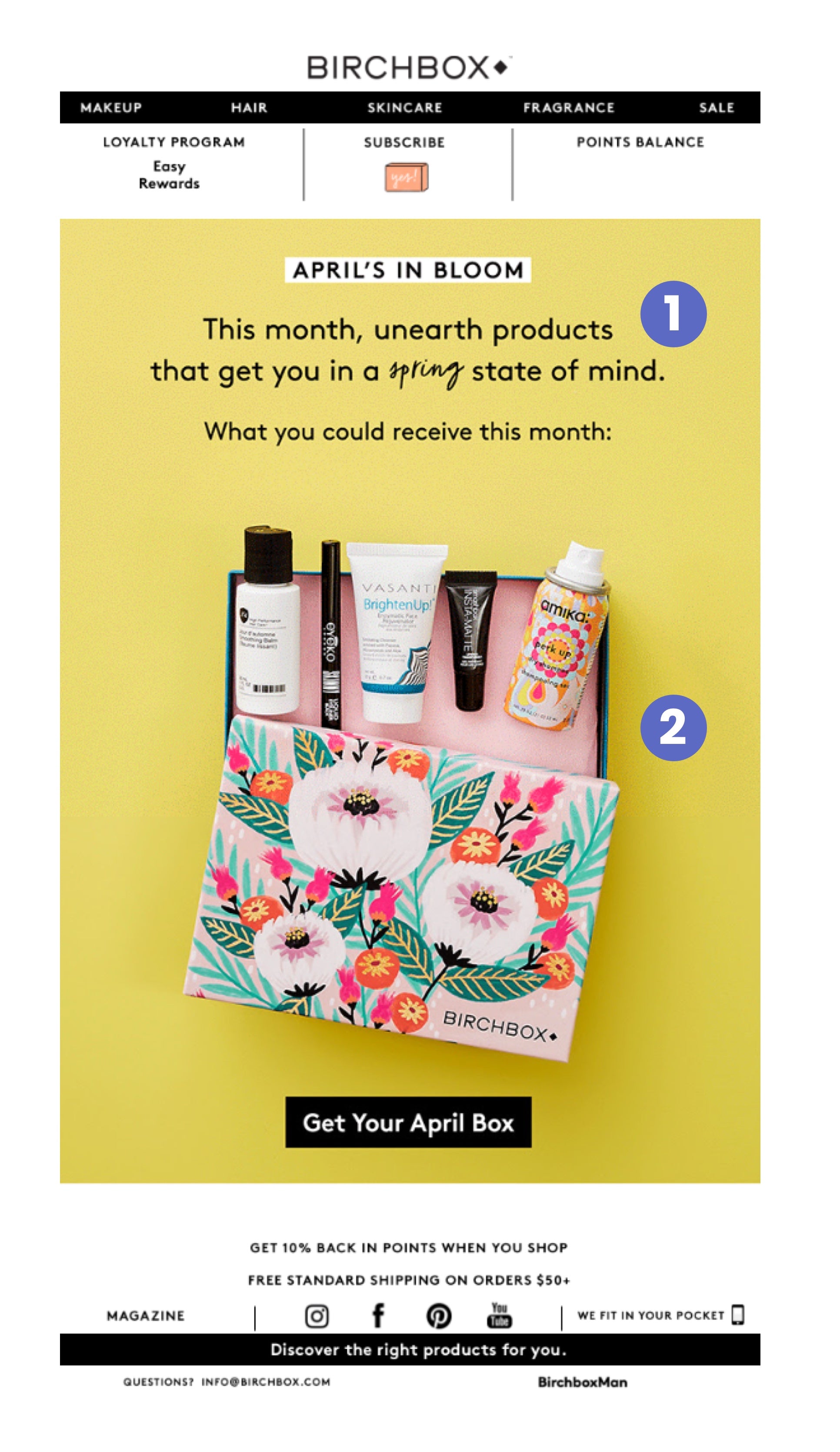
Teardown:
- A new visual theme for the month
The theme clearly focuses on the spring season and change it brings about, with crisp copy related to spring and gardening.
- Compelling product photography
The products are nicely lined up just outside the box and partially point to the copy above. Once again, there is a specific call to action in “Get Your April Box.”
Key takeaways:
- Developing a rhythm for your email marketing helps subscribers anticipate, even look forward to getting certain emails.
Day 54, Email 22: Free gift promotional email
Subject line: “Take the Leap With This Free Lipstick ”
Preview text: “Join today and get a free mini Lipstick Queen Frog Prince Lipstick. Birchbox”
Date: Wed, Apr 4, 2018 at 1:02 PM

Teardown:
- Community-focused photography
The hero image in the center showcases Birchbox’s diverse, friendly community of customers.
- Direct call-to-action
This time the “highlighted” code is at the top of all the copy so you immediately notice it. The copy of the email is similar to past email offers, but there’s no need to fix what isn’t broken.
Key takeaways:
- Now that we’ve been able to see a few special offers with free products as incentives to join, it’s good to see the variety in the incentives being offered. The new offers in each email make you forget that the same template is being applied to each one.
Learn more: Online shopping statistics
Instant replay: Lessons from Birchbox’s email marketing
Through these emails from Birchbox, we’ve seen some pretty effective email marketing tactics. It’s interested to note that the frequency of emails was relatively high at 22 emails in 2 months. In a previous teardown for Casper, I received 10 emails in the same amount of time.
Birchbox is able to do this because they regularly offer free gifts—one of the best forms of “value” you can expect from a brand in your inbox, which makes it hard to unsubscribe.
That said, there was definitely a clear pattern to their emails, which makes sense for a subscription-based business selling monthly themed boxes. To the company’s credit, it came across as reliable instead of repetitive thanks to all the inspired copywriting and design choices.
As far as the tactics we saw from individual emails, let’s recap the most important ones that you might carry forward to your own business:
- Consider letting subscribers tell you what they’re interested in when they opt in —in the case of Birchbox, the options were beauty or grooming.
- Leverage partnerships with big, well known brands in your industry to create extra demand or test product lines.
- Craft templates for recurring emails where you can swap out the content to keep it fresh.
- The prospect of free gifts can help ensure your subscribers stay on your list.
- Send reminder emails at the end of your promotion period to reach those who may have missed your offer the first time or forgotten about it.
- Find authentic ways to be part of larger conversations and build a brand purpose that focuses on people, not just your products.
- Keep a consistent header and footer to train your prospective customers to look to the center of the email for the offer. You can use design and photography techniques like frames, product placement or direction, and color balance help to make this more obvious.
While Birchbox has a lot of great creative across their emails, they're also perfectly fine with cost-effective approaches like re-sending an offer that people may have missed the first time. What’s more, despite the large volume of emails I got, they stuck by the cardinal rule of great email marketing, which is to deliver value in every email.
Do you have a favorite email marketing tip or trick that was (or wasn’t) covered here? What did you think about Birchbox’s emails, and what would you do differently? Let me know in the comments below!

