Customizing Your Shopify Theme: How to Use Images, Colors, and Fonts
 When you’re shopping for a theme, you’re evaluating each one after it’s been set up with images, fonts, and colors. It’s great to see a theme at its full potential, but once you’ve installed it on your store, you’ll need to do some work to get the theme looking just right.
That’s where design choices come in, which can be intimidating when you don’t have any experience making them. That’s what we’re tackling today in Ask Shopify.
How should I customize my theme?
I just installed an online store Shopify theme, and I want to customize it a bit to fit my brand. Is there anything I should watch out for as a big "don't" when I'm playing around with my theme? I don't have a design background, so guidelines on what to do would be great.
Learn More: Store Names: How to Choose the Perfect One for Your Ecommerce Site
Answer:
The great thing about working with a theme is that a lot of the structural design decisions are made for you. You don’t need to worry about how to lay out your pages, or where to put each image and each paragraph.
But to get your store looking its best, and to make your brand really shine, you’ll need to add your own touch to a theme. Think of it like decorating a house—the fundamentals are all there, but you get to choose the colors and tweak the decor.
When you’re new to the world of web design, the amount of choices you can make is staggering, and can even feel overwhelming. You can use any color you want! You can switch things up with the click of a mouse!
To help you navigate the wide world of design decisions, and make the right ones for your store, we turned to Lawrence Callender, a theme specialist here at Shopify. He outlined some key design guidelines that can help anyone get their theme set up and keep it looking on-brand and polished.
Hire experts with proven, Shopify-specific skills
The Shopify Experts Marketplace helps connect you with experienced Shopify web designers who you can hire to give you expert guidance, or even do the design work for you.
Hire expert help todayUse the right image resolutions
Images are a cornerstone of your ecommerce store, from your hero image on the home page to your product photography. When you install a new theme, you’ll notice right away that the lack of photos is obvious, so getting your images on point can be a big boost to your store.
However, there are some technical to-dos that can ensure your photography works as hard as you need it to.
“Make sure you’re uploading images in high resolution, so at least 1024px by 1024px,” says Lawrence. “If possible, we recommend uploading product images at Shopify's maximum resolution, which is 2048px by 2048px. If your image size is too small, it’ll result in pixelated, blurry images.”
Keep image size ratios in mind
Your product images can be used in multiple places on your store, including featured products on your homepage and on your collection pages. To create a consistent experience on those pages, keep your image’s height-to-width ratio in mind when uploading them.
“When your product images are shown side by side in your collection pages, they often have different sizes,” says Lawrence. “To make sure that your images appear the same size on these pages, check that the images that you add as your featured images are cropped at a consistent height-to-width ratio.”

So if you want all of your product images to show up as consistently-sized squares, save them all with a 1:1 height-to-width ratio. Even if your images are different sizes, keeping the ratio consistent will give you a really clean, well-laid out display wherever your products are featured on your store.
Commit to a color palette
Choosing colors for your brand can be intimidating. Do they look good together? Are bright colors store or neutral colors a better fit for your brand? There’s a whole spectrum to choose from, but Lawrence has some advice to help you narrow down your options.
“If you already have a logo, a general rule is to pick few accent colors that match your brand or logo,” advises Lawrence.
“If you don’t have specified brand colors already, look for inspiration in the types products that you carry. For example, if you sell wood furniture or leather goods, natural colors like brown browns, beige and oranges might be a great place to start.”
To help find some inspiration of what that might look like, you can use an online color palette tool, many of which will also offer examples of great color pallettes created by other people or brands.

Once you’ve picked some colors that look good and fit with your products and your branding, make sure to save the specific hexadecimal codes that represent the colors. That’s the six letter-and-number combo that online platforms and design tools will use to give you an exact match anywhere you need to use your colors, and it looks something like this:
- #FFFFFF - White
- #2D2D2D - Very Dark Grey
- #50B83C - Green
Further Reading: It can be daunting to try to DIY an entire visual brand on your own. Here's a full primer on how to build a visual brand from scratch.
Use no more than 3 fonts
Now that your images and colors are locked down, it’s time to think about how you want to display your words. The fonts you choose can be a strong part of your branding, but just like with your other design elements, consistency is key.
“It’s best to limit yourself to two or three fonts, and stick with them throughout your design,” says Lawrence. “When you use more than three typefaces, you start to detract from the content. The reader can become confused and have trouble following the flow of information.”
You’re looking for a balance between legibility, consistency, and clarity. If your fonts hit those marks, no matter which fonts you choose, you’ll be on the right track.
Pick fonts that complement each other
Many of the best ecommerce store designs use a combination of different fonts, so you don’t have to stick to just one font or even one style.
“When you’re pairing fonts, you want to find fonts that complement each other, don't fight for attention, and work together without becoming boring,” says Lawrence.
There are some standard approaches that can help you sort through all of the paid and free options available as you try to find the perfect pairing.
Use fonts from the same family
“The quickest way to find perfect font combinations is by using different fonts within the same font family,” advises Lawrence.
A font family is something like Helvetica or Times New Roman, and the fonts within it have a few variations.
“Fonts from the same family already already have an assortment of weights and styles that work well together.”
A heavier weight font would be something like the bold version of the font, while a style variation might be an all-caps version.

If you have a font that you love, you can use a bold version, a regular version, and an italicized version to differentiate your headings and other information. It’s a way to make a single typeface family work for your whole store, while still giving you clear differences between different types of content.
Pair compatible typefaces
If you’ve never worked with fonts before, here’s a quick primer on typefaces. There are a few different basic styles of text that you’ll find.
- Serif: These typefaces have the little feet on each letter, like Times New Roman and Georgia.
- Sans serif: These typefaces don’t have the little feet, like Arial, Helvetica, and the font you’re reading right now.
- Script: These typefaces are anything that looks like calligraphy or handwriting.
- Monospace: These typefaces have letters that are all equally spaced out, and are what you usually see in computer code. A good example is Roboto Mono.
You can pair up two fonts from different typefaces to get a strong contrast between them.
“Combining typefaces based on contrast is great for establishing hierarchy,” says Lawrence. “Using contrasting typefaces makes it clear which paragraphs are headings and subheadings and which are body copy.”
When you’re thinking about hierarchy, you’re really just thinking about how to show your customers what’s most important. In this post, we used headings to help you figure out what each section is about. That’s an example of a hierarchy, and you can use different fonts to help your headings stand out.
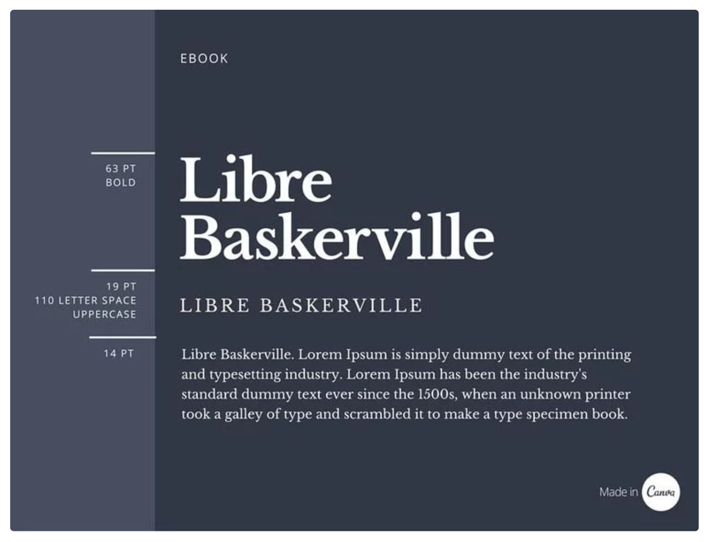
If you’re still stuck on which fonts or typefaces to pair, this guide from Canva on pairing fonts is a great place to start. As well, a quick search for “sans serif and serif font pairings” will turn up articles that give you both free and paid options.
Use font sizes intentionally
No matter what font pairings you choose, the size of your font in different places on your website should have additional meaning, and help your customers find what they’re looking for.
“The more important your content is, the larger the font size should be. Use varying font sizes to highlight what’s important, and to inform your users of the purpose and content of your website.”
Once you’ve chosen a font size for your body content and your headings, make sure to stick with it so that your customers can easily tell what’s a headline and what’s a paragraph. The easier your site is to read and navigate, the fewer hurdles there are before you can close a sale.
Consistency is the best design guideline
Once you’ve worked through decisions about fonts, colors, and your general brand guideline, the most important thing you can do for your store’s design is to stick to them.
“Great design tends to work within a set of constraints,” says Lawrence. “A lot of design rules are actually just constraints to provide some focus and direction in your design.”
While it can be tempting to indulge in new fonts and colors on different pages or simply when the mood strikes, remember that consistency is the cornerstone of building a brand. You want your customers to be able to identify and navigate your store easily, and sticking to a core set of fonts, colors, and styles can go a long way towards that goal.
Bring your Business Online with the Express Theme
Express is a free theme designed for businesses with small to medium product catalogues that are looking to get online quickly and meet their customers where they're purchasing from today.
Preview the Express Theme