5 Psychological Design Tactics that Make Brains Tick and Visitors Click

First impressions can make or break your business.
The layout of your website, the colors you use, the copy on buy buttons – design is everything when it comes to first impressions.
That’s why it’s important to tap into what make brains tick, and why certain design aesthetics persuade visitors to take a desired action on your website.
Shopify Academy Course: How to Design Your Online Store
Creative director Stephan Peralta demonstrates how to design a brand people love and an online store even the most casual browsers want to buy from.
Enroll for free1. Use Human Behavior as a Catalyst for Design
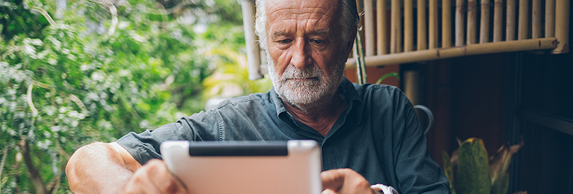
Perhaps overlooked when building your website is the idea of designing for humans first. More importantly, designing for your target market first. Just because something makes sense to you, doesn’t mean it makes sense for a visitor – or your business.
What does that mean? Well, let’s take a look at one of the most popular websites on the internet.
Craigslist has an infamously...interesting design based on today's standards. In fact, a few people have taken a crack at redesigning it. But why haven’t they changed it?
The purpose of Craigslist is to do two things: post an ad, or find an ad. They’re a data driven company that’s based their business on familiarity and ease of use. They know what their target market is, and the purpose their website needs to serve.
And, they do it perfectly.
It’s almost the same premise with Reddit. Yes, it’s quite barebones – but the visitors don’t need (and in most cases, don’t want) a beautiful design experience for what they’re doing.
How can you implement that simplicity, and notion of designing for humans into your website so that it's easier for your visitors to use?
Consider this: Take a look at The User is My Mom for some fun user testing. See if your website is designed with humans in mind. Don’t want to pay for someone to test your website? Why not have an older friend, relative, or colleague give it a shot and get their feedback!
2. Color Can Influence Shoppers

Color theory is one of my favorite topics when it comes to design and marketing. The fact that certain colors can convey so many different emotions and actions is fascinating.
There has been a lot of fluffy theories about color – mainly because a lot of things like personal preference, history, and more, can influence what certain colors mean. What red means to me, might mean something totally different to you.
That being said, it’s important to understand the fundamentals of color theory when it pertains to marketing.
Take a look at this informative chart from The Logo Company that analyzes what different colors brands use, and what each color means.

via The Logo Company
In a study by the team at KISSmetrics – they found some pretty interesting information regarding the psychology of color.
Red: Increases heart rate, creates sense of urgency, often associated with sales.
Blue: Creates the sensation of trust and security, often associated with banks.
Green: Often associated with wealth, easiest color for the eye to process.
Something else that I thought was worth mentioning, is that in that study, KISSmetrics found that 93% of shoppers consider visual appearance to be more important than any other senses when looking at marketing material.
Furthermore, they found that men prefer bright colors, while women prefer softer, more pastel-like colors.
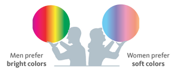
via KISSmetrics
Is there anything here that you might be able to apply to your website?
Consider this: Be sure to take a look at the Shopify Theme Store for a new design that might pique your visitors interest based on a color preset.
3. Hick’s Law Says Too Many Options Means No Decision

How many times have you found yourself at the grocery store trying to decide what type of chips to buy? You’re staring at a wall of colors and the thought of picking Miss Vickies over Lays is panic inducing.
The same thing happens to a visitor when you give them too many options on your website.
Too many navigation links, products to pick from, images to look at, or even shipping options to consider can be too much for a visitor to handle. They’ll get overwhelmed, and will leave without completing a purchase or taking the desired action.
When it comes to web design – think of some of the most popular websites and how they're designed. How many options do you have when you visit Facebook, Twitter, or even Shopify? You're most likely given very few things to click on – and the most prominent thing on the page is what the desired action is. Whether that be a signup form, picture, or buy button, it's all done with purpose to minimize options.
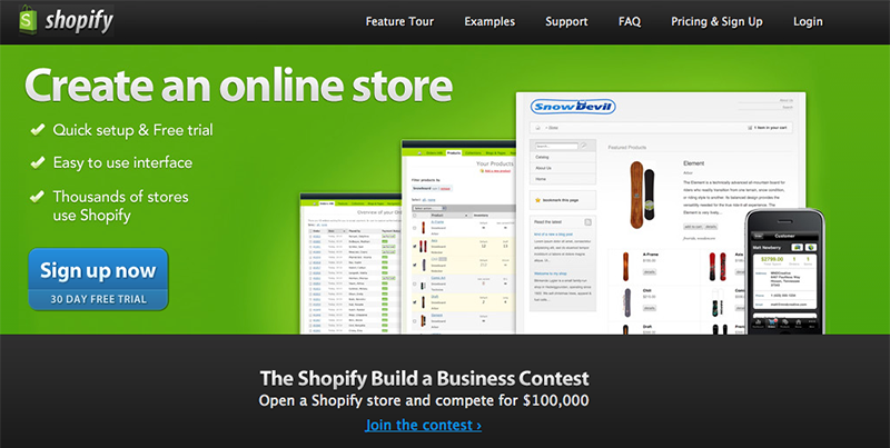
Using the Wayback Machine, you'll notice that these companies have gone through many iterations of landing pages and have now become a very stripped down version of what they once were.
Here's an example of Shopify in 2010:
And here's an example of how it looks today:
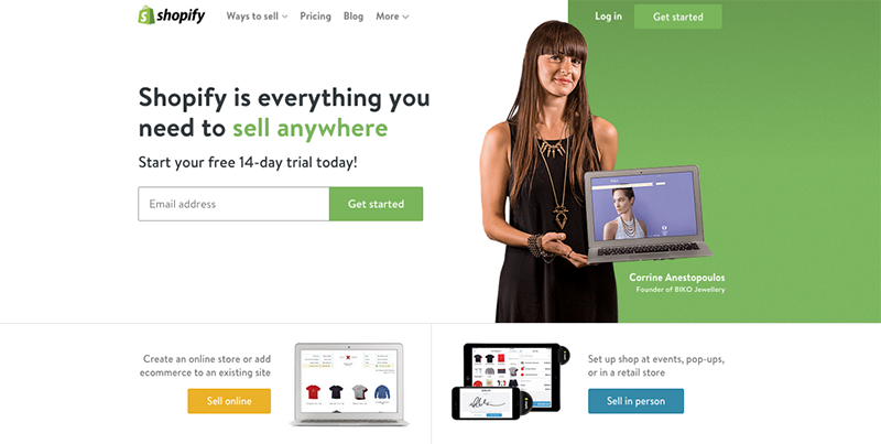
Notice how there's far less clutter on the page, and it's much simpler to navigate?
Consider this: Remove the noise from your website. Too many navigation links, photos, or collections? Do a quick purge and take out whatever isn’t absolutely necessary.
4. Think Mobile and Ease of Use

Okay so we now know that mobile is taking over the world. Who knows how long it will be until desktop and laptop computers are totally obsolete.
That might be a bold statement – but in the design world, designing for comfort and ease of use knowing that people are using their thumbs and fingers to interact with your website is essential.
Take a look at this great infographic from 9to5mac – it helps explain the idea of mobile comfort.

via 9to5mac
The goal here? Make it easy for someone to use your store with their thumbs. Make specific call to action buttons or copy within “thumbs-reach” depending on whether someone is browsing on a mobile device or tablet.
Consider this: Play around with your website on different mobile devices and see if there are any important buttons or links that are not within "thumbs-reach". Make edits where necessary.
5. Faces are Humanizing and Sincere

You like to see a smiling face. Who doesn’t? It’s probably one of the most familiar and pleasant things in the world. It’s one of the only things that everyone understands – no matter what language you speak, or what your background is.
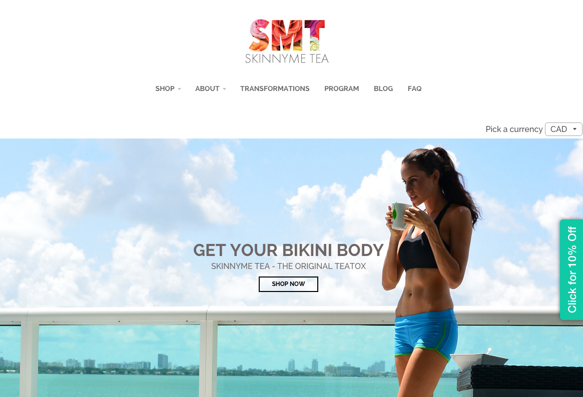
A study from Caltech showed that our brains have cells that respond only to faces. This part of the brain is called the Fusiform Gyrus – and no other object, form, or item could get this part of the brain to spark. Pretty cool, right? Now, how can you get that part of a visitors brain to start firing?
Take a look at how SkinnyMe Tea has used this to emphasize their call to action in their main hero image.
via SkinnyMe Tea
There are so many other ways to use faces in your website design too. You can visualize and elicit emotions, create trust (using employee pictures), engage your visitors (with someone staring at them), and so much more.
The best practice here? Have a picture of someone looking directly at (or pointing towards) whatever it is you want the visitor to pay attention to.
Consider this: Try finding some free stock images that include faces in them. See if there's anywhere that you can include them on your website.
Conclusion
Now that we've taken a look at some design tactics you can implement into your website, it's up to you to put these tactics into play.
Let us know in the comments below if there are any other design tips and tricks that will persuade visitors to take action, and click!

About the Author
Tucker Schreiber is an entrepreneur and content crafter at Shopify. He writes to inspire and educate readers on all things commerce.
Follow @tuckerschreiber
