Warning: Are These Four Ecommerce Conversion Killers Hurting Your Sales?

Do you have lots of visitors but not a great deal of sales? In other words, are you having trouble converting customers?
It’s a condition that affects many online stores. But don’t worry: It can be fixed.
There are lots of reasons for people being hesitant to buy from you after they visit your online store. In this post, we diagnose the most common issues for why someone would fail to make a purchase after they visit. Then we propose solutions so that you can make your customers feel more secure and more comfortable buying your products.
Here are common problems, as well as their solutions.
Problem: Low-quality photographs
Say you sell apparel, like t-shirts or scarves.
In a retail store, your customers have the opportunity to examine your products from every angle, and also to try them on for fit and style. They know then and there whether it’s a fit and whether it’s a good buy.
You should approximate that experience as closely as you can. The single best thing that you can do is to have good photographs of the product in different angles. Better yet, have not only photographs of your product, but also people modeling your product.
You can’t expect people to feel compelled to buy if you snap just any picture at all. Your photo shouldn’t be poorly-lit; there shouldn’t be weird shadows; and it should be displayed clearly, perhaps on a stand. It just feels shady if your products aren’t crisp and compelling. Without good product photography, not only do people miss out on what it's like to feel the real thing, but they have a sense that you're less than professional.
So go ahead, take better photographs and put your products in the best light possible.
Here’s the solution
Improving product photography doesn’t have to be expensive.
Besides buying a decent white background, it really doesn’t require much more in terms of an investment. Set up your shoot by a window on a sunny day to avoid lighting equipment, and use your iPhone, which has a fantastic camera, to take the pictures. Different tools may be more appropriate depending on your requirements.
Depending on your requirements, you may may consider purchasing something better to help your shoot.
Once you’ve taken the photos it’s time to edit. There are lots of photo editing tools, both paid and free, to do the task. Consult the guide on product photography on the “how’s” of using all the tools.
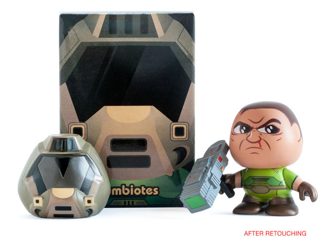
So go ahead, edit your photos. You'll turn something like this:
To this:

Problem: Weak product descriptions
It’s not just improving the quality of your pictures. Your copy matters too.
Product descriptions are incredibly important. A study has shown that merely touching a product increases a person’s desire to own it. The closest thing to replicating online touching an object? Describing it in such detail that a prospective customer feels like he’s holding it.
Writing weak copy is a huge lost opportunity to entice the customer to buy. You lose the chance to tell a story, as well as the ability to differentiate your product along yet another dimension.
But it’s not just the case that not having good copy will hurt you. You’ll be hurt much more if your copy is bad.
The only thing worse than an inadequate and unsatisfying product description is one that’s rife with spelling mistakes, grammatical errors, or inept ways of describing the product.
Think about it in terms of the Broken Windows Theory.
The Broken Windows Theory was originally applied to analyze crime in neighborhoods. The hypothesis is that small issues like broken windows or minor vandalism in a neighborhood may not actually be a real nuisance, but signals that nuisance is generally tolerated. And that tends to encourage crime.
Now let’s apply it to ecommerce.
If a customer sees a product description that’s less than fully-professional, then he may start to wonder whether anything else is going to be sloppy. Is the product going to be less than promised, perhaps? Will you make a spelling mistake in the shipping process and deliver a package to the wrong house? Is it totally safe to trust you with my credit card?
Don’t turn your customer off. Clean up copy mistakes and use your product descriptions to sell.
Here’s the solution
Write better copy. Here are a few examples. Instead of nearly-meaningless words like:
These socks are innovatively designed and manufactured with unparalleled craftsmanship.
Be more specific and say:
These socks finely-rendered, with soft textures that offer a great deal of comfort.
Are you exhaustively technical, trying to show every angle of your product’s superiority? Instead of saying something like:
This blender has a 2-speed motor that operates at 27,000-RPM…
Talk about the benefit instead, like this:
This blender's powerful motor can crush ice to any desired consistency…
Tell a story, and make sure that you don’t have any spelling mistakes.
Problem: Your online store is badly-designed
Walking into a store and finding products totally disorganized is more than just a hassle. It can be so frustrating that you choose not to make a purchase at all.
Think that experience can happen online? You bet.
There are two main issues around your store design that could be turning people away: First, you may be making it difficult for customers to find the product that they’re looking for; second, you may be arranging your products in such a way that discourages people from making a purchase.
Here are some common ways that an online store obscures its products:
- Your homepage doesn’t prominently link to your storefront.
- Your product categories aren’t all displayed in a single place.
- Some of your products are hidden deep beneath collections.
The other design issue is the arrangement of your products. There are tricky issues here too.
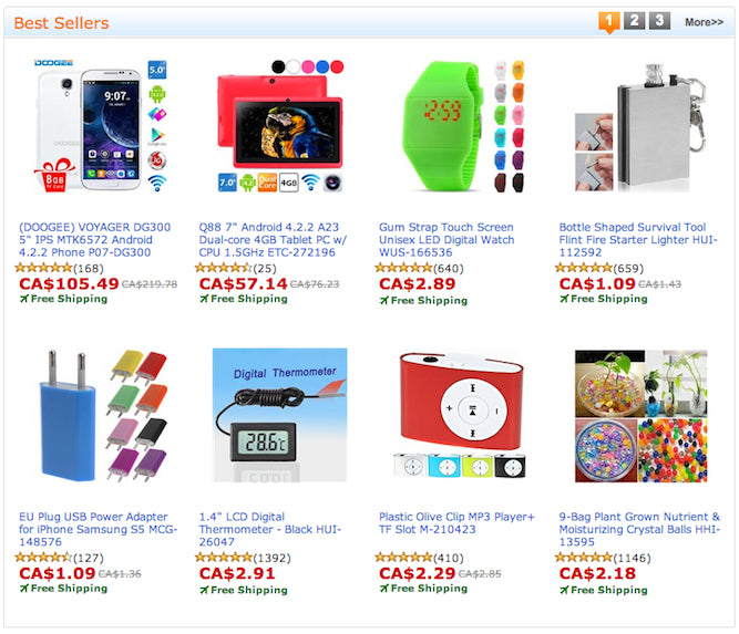
Online stores with lots of products may feel tempted to create the online equivalent of bulla bulla, IKEA’s practice of putting a bunch of items together to give off a sense of volume.
In practice, the result looks something like this:

Meanwhile, even if your products are arranged clearly and logically, you may suffer from overwhelming the customer with images.
At a certain point, when there are too many images, people tend to skim and ignore products. When people start just browsing, they don’t think very hard about whether they want the product.
Here’s the solution
Find a good theme, with responsive design, and make sure that your storefront is easily navigable. The rule of thumb is that no product should ever be more than three clicks away from the homepage.
Of course, navigability is affected by the way you arrange your collections as well. Make sure that there’s an intuitive category for every product, and that every product is where it ought to be.
In terms of the best way to arrange your products, there’s science-backed evidence that you really shouldn’t be overwhelming your customers with too many images. The way to fix that is to better segment your products and introduce copy here and there to make sure that people have a clear value proposition to grab on to.
Make the process for finding your products intuitive, that you’re giving customers the chance to really contemplate your product, and you’re giving them a good reason to buy.
Problem: You haven’t established trust
You can count on a certain degree of trust when you’re buying from a physical location, even if it’s a temporary stall or a pop-up shop. You get your goods immediately, and can probably count on the store to stay around at least for a little while if you have complaints. And at the very least before you make a purchase you’ll have chatted with the owner and will have gotten to know her a little.
On the internet not all of that is going to apply.
What will you think when you go to an online store with none of the following?:
- An About Us page that presents no actual details about the company, only a few intangible value propositions
- No customer testimonials or product reviews
- No press coverage
- No name, phone number, or email anywhere on the website
- No general guarantee that your payments information is safe
Would you feel very secure making a purchase of any size from a site like that?
Here’s the solution
There’s a variety of things that you can do to improve the trustworthiness of your store.
Make sure that you craft a good About Us page with your story. Tell your customers of your background, and why you wanted to start a store. And you should add at the very least your first name, so that your customers have someone to address to, beyond “Dear Owner...”
Have any press wins? You should feature them prominently. Check out, for example, the exemplary press page of Slyde Handboards, with the banners of various publications.

If you haven’t had much press coverage you should at least integrate some product reviews. According to the online magazine Internet Retailer, you can increase your conversion rate by 14-76% by adding product reviews to your online store. With the Product Reviews app, you can easily integrate customer reviews into your store.
Take a look, for example, at Raw Generation’s dedicated page of product reviews, which features almost 700 reviews from customers.

Although it may not be essential to have a dedicated phone number to handle inquiries and support, you should have at least an email for people to reach you at. It can be as simple as hi@yourbusiness.com, or support@yourbusiness.com.
You should be giving lots of reasons for people to trust you, either by grabbing on to your story or offering third-party testimonials.
Conclusion
This post is about more than getting new visitors to your online store. It’s about converting them and overcoming their objections to buy once they’re there. Make sure that you do everything you can to make the shopping experience a simple and intuitive one, and that you’re giving them lots of reasons to trust that you’re a professional.